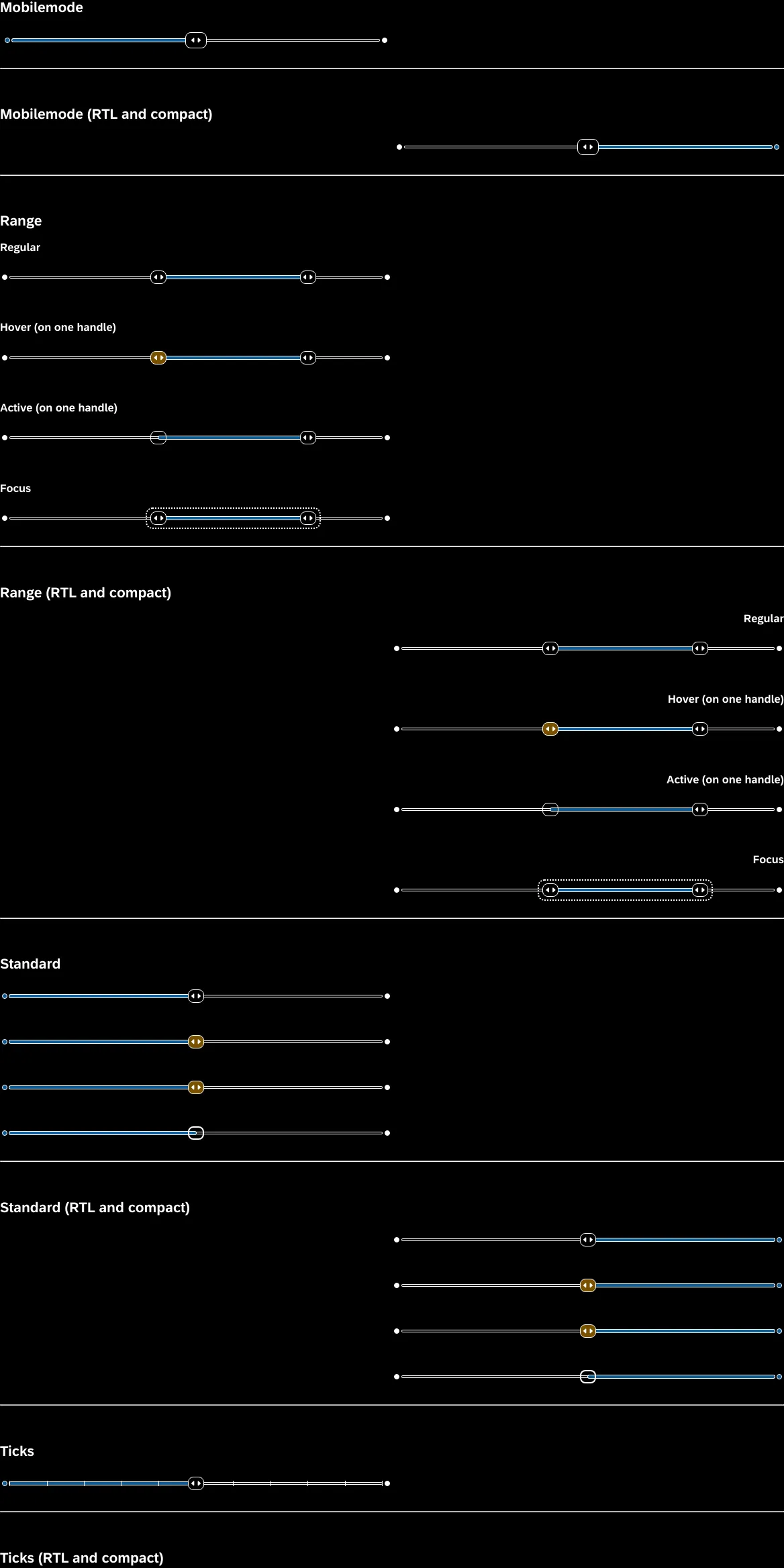
SAP fundamental-styles
Fundamental Library Styles 是一個輕量級呈現層,可以與開發人員所選擇的 UI 框架一起使用 (例如 Angular, React, Vue 等)。開發人員可以透過結合 Fundamental Styles、樣式表和 HTML 標籤庫,在任何基於 Web 的技術中構建一致的 Fiori 應用程式。

- + 24
Horizon High Contrast Black
1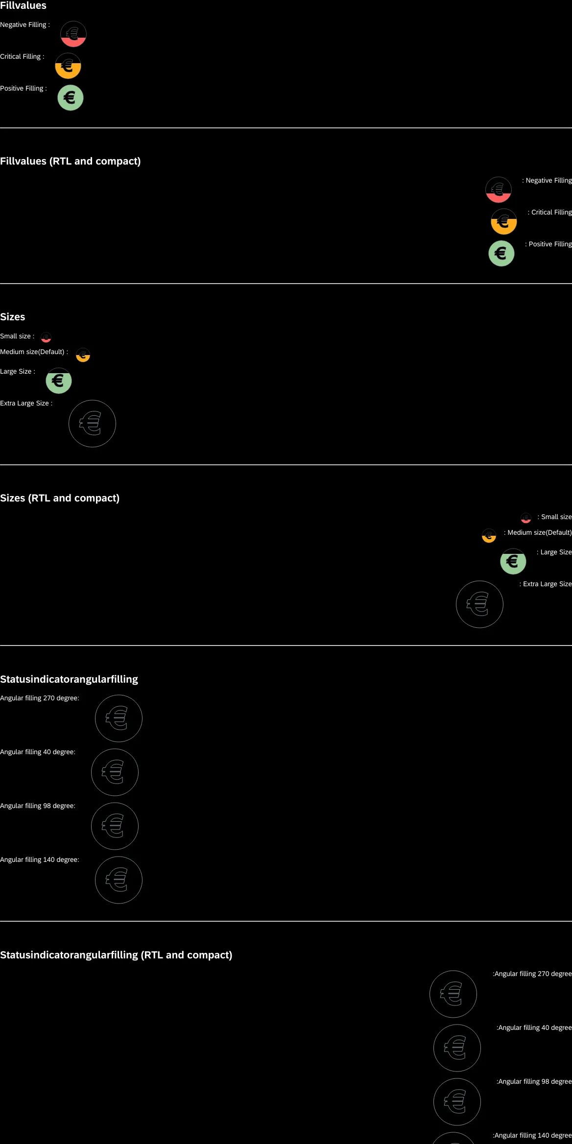
Horizon High Contrast Black
1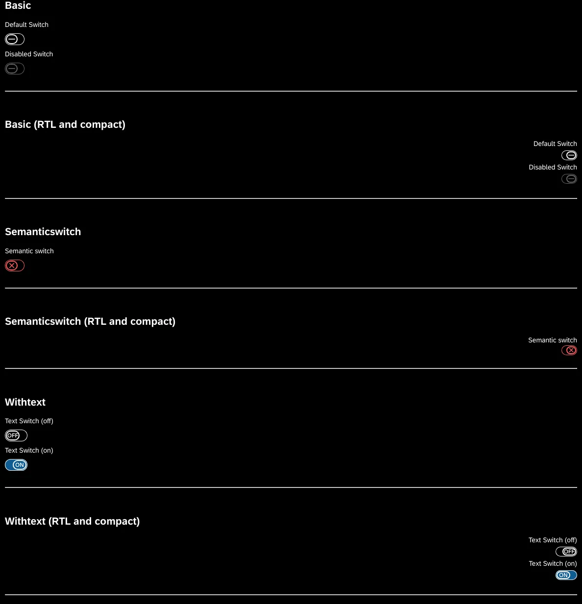
Horizon High Contrast Black
1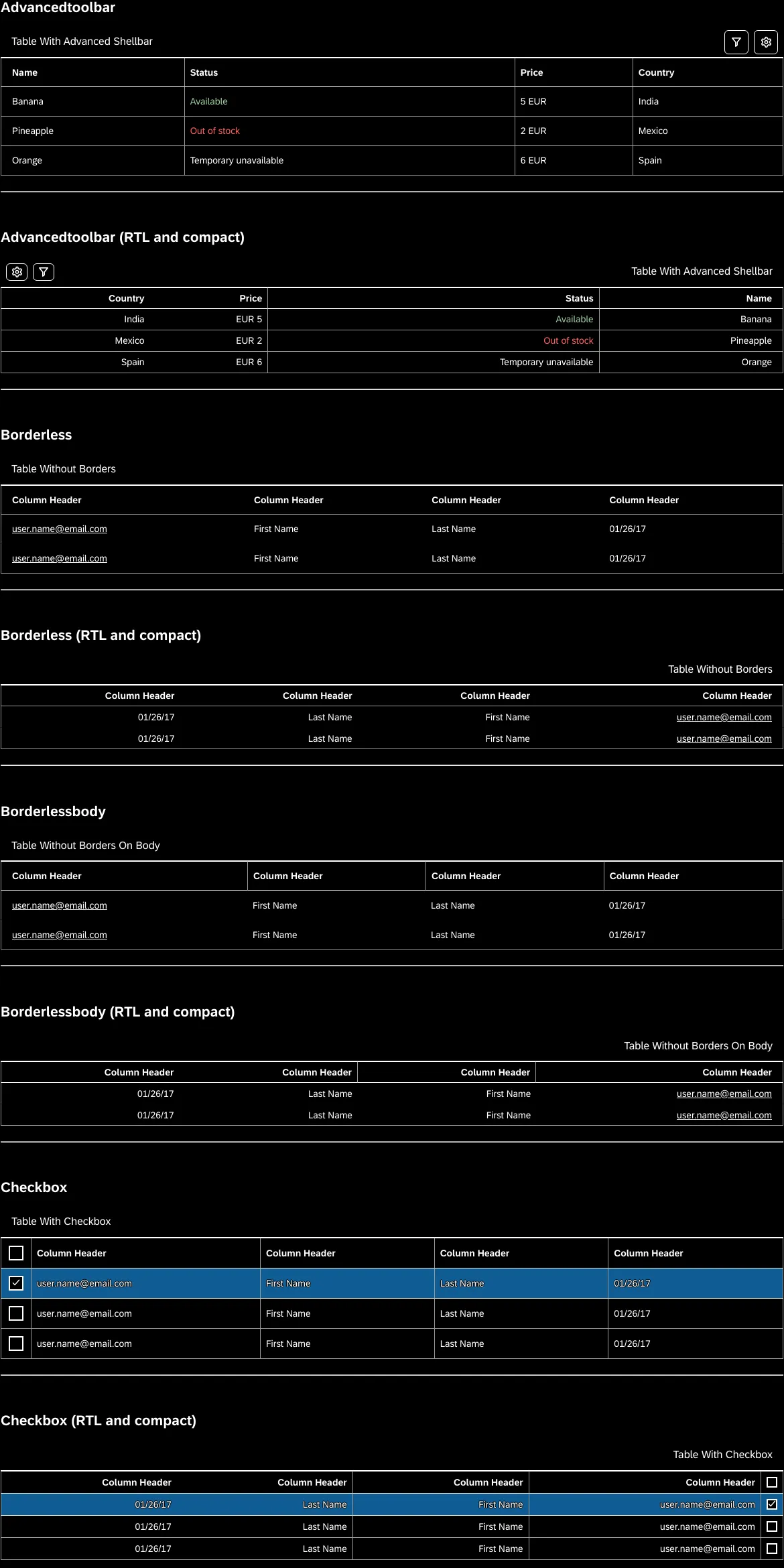
Horizon High Contrast Black
1
Horizon High Contrast Black
1
Horizon High Contrast Black
1
Horizon High Contrast Black
1
Horizon High Contrast Black
1
Horizon High Contrast Black
1
Horizon High Contrast Black
1
Horizon High Contrast Black
1
Horizon High Contrast Black
1
Horizon High Contrast Black
1
Horizon High Contrast Black
1
Horizon High Contrast Black
1
Horizon High Contrast Black
1
Horizon High Contrast Black
1
Horizon High Contrast Black
1
Horizon High Contrast Black
1
Horizon High Contrast Black
1此專案中的附加元件
Actions
Get UI feedback when an action is performed on an interactive element
5.8M
Downloads
- + 8
Docs
Document component usage and properties in Markdown
5.3M
Downloads
- + 8
Controls
Interact with component inputs dynamically in the Storybook UI
5.3M
Downloads
- + 8
Viewport
Build responsive components by adjusting Storybook’s viewport size and orientation
5.3M
Downloads
- + 8
Toolbars
Create your own toolbar items that control story rendering
5.1M
Downloads
- + 8
Links
Link stories together to build demos and prototypes with your UI components
4.4M
Downloads
- + 8
Chromatic
Automate visual testing across browsers. Gather UI feedback. Versioned documentation.
2.1M
Downloads
- + 6
Accessibility
Test component compliance with web accessibility standards
1.7M
Downloads
- + 8
Visual Tests
Catch unexpected visual changes & UI bugs in your stories
1.2M
Downloads
- + 10
類似專案
新增您的專案
Web


Natura Design System


Blueberry Design System

