Storybook 擴充功能 Material-UI
提供開發環境,協助建立 Material-UI 元件。這是 React Storybook 的擴充功能,會將您的元件包裝在 MuiThemeProvider 中。這可以加速並簡化基於 Material-UI 的應用程式的開發流程。
您可以使用此專案的示範頁面,探索任何元件的 Material-UI 主題設定,並直接線上建立您自己的新主題。但是,要充分利用此專案,請在您的工作環境中在本機執行。
功能
- 包裝在主題供應器中。只需開始使用基本淺色主題進行開發即可。
- 已注入 TapEvent 外掛程式。在行動裝置上進行測試。
- 切換主題。一鍵查看外觀。
- 建立您的自訂主題。透過程式碼或在視覺編輯器中建立。
- 動態視覺主題編輯。探索所有可用的主題屬性。
- Google 材質顏色調色盤選擇器
- 儲存所做的變更並下載 JSON 檔案
- 屬於 React Theming 的一部分。建立可設定主題的 React 元件。
- 適用於 Storybook 3.0
快速開始
為了快速開始使用最新的 storybook-addon-material-ui,您可以查看 create-material-ui-app
其中包含以下項目的工作設定:
- create-react-app
- Storybook
- Material-UI
- storybook-addon-material-ui
開始使用
首先,安裝擴充功能
npm i storybook-addon-material-ui --save-dev
Storybook 6.1
將 storybook-addon-material-ui 新增至 Storybook 擴充功能
//.storybook/main.js

module.exports = {
  stories: ['../stories/**/*.stories.(js|mdx)'],
  addons: [
    'storybook-addon-material-ui'
  ],
};
將裝飾器新增至 Storybook 預覽
//.storybook/preview.js

import { muiTheme } from 'storybook-addon-material-ui'

export const decorators = [
	muiTheme()
];
注意:您可以在已載入的主題之間切換。開箱即用,您有兩個基本主題,但您可以像這樣輕鬆新增自訂主題
//.storybook/preview.js

import { muiTheme } from 'storybook-addon-material-ui'

// Create your own theme like this.
// Note: you can specify theme name in `themeName` field. Otherwise it will be displayed by the number.
// you can specify only required fields overriding the `Light Base Theme`
const newTheme = {
    themeName: 'Grey Theme',
    palette: {
        primary1Color: '#00bcd4',
        alternateTextColor: '#4a4a4a',
        canvasColor: '#616161',
        textColor: '#bdbdbd',
        secondaryTextColor: 'rgba(255, 255, 255, 0.54)',
        disabledColor: '#757575',
        accent1Color: '#607d8b',
    },
};


export const decorators = [
	muiTheme([newTheme])
];
甚至可以從其他地方匯入
//.storybook/preview.js

import { muiTheme } from 'storybook-addon-material-ui'

import theme1 from './src/theme/theme1'
import theme2 from './src/theme/theme2'

export const decorators = [
	muiTheme([theme1, theme2])
];
Storybook 5 (以及較舊版本)
現在,使用 Material-UI 擴充功能撰寫您的故事。預設情況下,您的故事會提供 淺色基本主題 和 深色基本主題
import React from 'react';
import { storiesOf, addDecorator } from '@storybook/react';
import {muiTheme} from 'storybook-addon-material-ui';
// Import some examples from react-theming https://github.com/react-theming/react-theme-provider/blob/master/example/
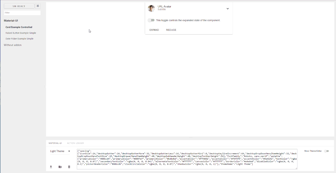
import CardExampleControlled from '../CardExampleControlled.jsx';
import RaisedButtonExampleSimple from '../RaisedButtonExampleSimple.jsx';
import DatePickerExampleSimple from '../DatePickerExampleSimple.jsx';
storiesOf('Material-UI', module)
// Add the `muiTheme` decorator to provide material-ui support to your stories.
// If you do not specify any arguments it starts with two default themes
// You can also configure `muiTheme` as a global decorator.
.addDecorator(muiTheme())
.add('Card Example Controlled', () => (
<CardExampleControlled />
))
.add('Raised Button Example Simple', () => (
<RaisedButtonExampleSimple />
))
.add('Date Picker Example Simple', () => (
<DatePickerExampleSimple />
));
注意:您可以在已載入的主題之間切換。開箱即用,您有兩個基本主題,但您可以像這樣輕鬆新增自訂主題
import React from 'react';
import { storiesOf, addDecorator } from '@storybook/react';

import {muiTheme} from 'storybook-addon-material-ui';

import CardExampleControlled from '../CardExampleControlled.jsx';
import RaisedButtonExampleSimple from '../RaisedButtonExampleSimple.jsx';
import DatePickerExampleSimple from '../DatePickerExampleSimple.jsx';

// Create your own theme like this.
// Note: you can specify theme name in `themeName` field. Otherwise it will be displayed by the number.
// you can specify only required fields overriding the `Light Base Theme`
const newTheme = {
    themeName: 'Grey Theme',
    palette: {
        primary1Color: '#00bcd4',
        alternateTextColor: '#4a4a4a',
        canvasColor: '#616161',
        textColor: '#bdbdbd',
        secondaryTextColor: 'rgba(255, 255, 255, 0.54)',
        disabledColor: '#757575',
        accent1Color: '#607d8b',
    },
};


storiesOf('Material-UI', module)
    .addDecorator(muiTheme([newTheme]))
    .add('Card Example Controlled', () => (
            <CardExampleControlled />
        ))
    .add('Raised Button Example Simple', () => (
            <RaisedButtonExampleSimple />
        ))
    .add('Date Picker Example Simple', () => (
            <DatePickerExampleSimple />
        ));
意見反應
您可以透過匿名問卷調查留下您對此專案的意見。
查詢字串參數
當您選擇主題和其他選項時,它會儲存在網址列中。因此,當您重新整理頁面時,此狀態會保留,而且您可以使用直接連結到所需的狀態。
https://127.0.0.1:9001/?theme-ind=0&theme-sidebar=true&theme-full=true
貢獻
開發人員
我們的團隊歡迎所有貢獻、測試和錯誤修正。如果您想要協助專案,請隨時提出問題、PR 或與我聯絡。
設計人員
我們非常歡迎設計人員參與此專案。我們對您使用此工具的意見、設計人員與開發人員共同工作的可能性,以及其外觀和功能非常感興趣
