
撰寫 Addon
Storybook addons 是擴展 Storybook 功能和自訂開發體驗的強大方法。它們可用於新增功能、自訂 UI 或與第三方工具整合。
我們將建置什麼?
本參考指南旨在幫助您開發 Storybook addons 如何運作的心智模型,方法是基於流行的 Outline addon 建置一個簡單的 addon。在本指南中,您將學習 addons 的結構、Storybook 的 API、如何在本地測試您的 addon,以及如何發佈它。
Addon 剖析
Addons 主要分為兩大類,每一類都有其作用
- 基於 UI:這些 addons 負責自訂介面、啟用常用任務的快捷方式,或在 UI 中顯示其他資訊。
- Presets:這些是預先設定的設定或組態,讓開發人員能夠快速設定和自訂其環境,並具有特定的一組功能、特性或技術。
基於 UI 的 Addons
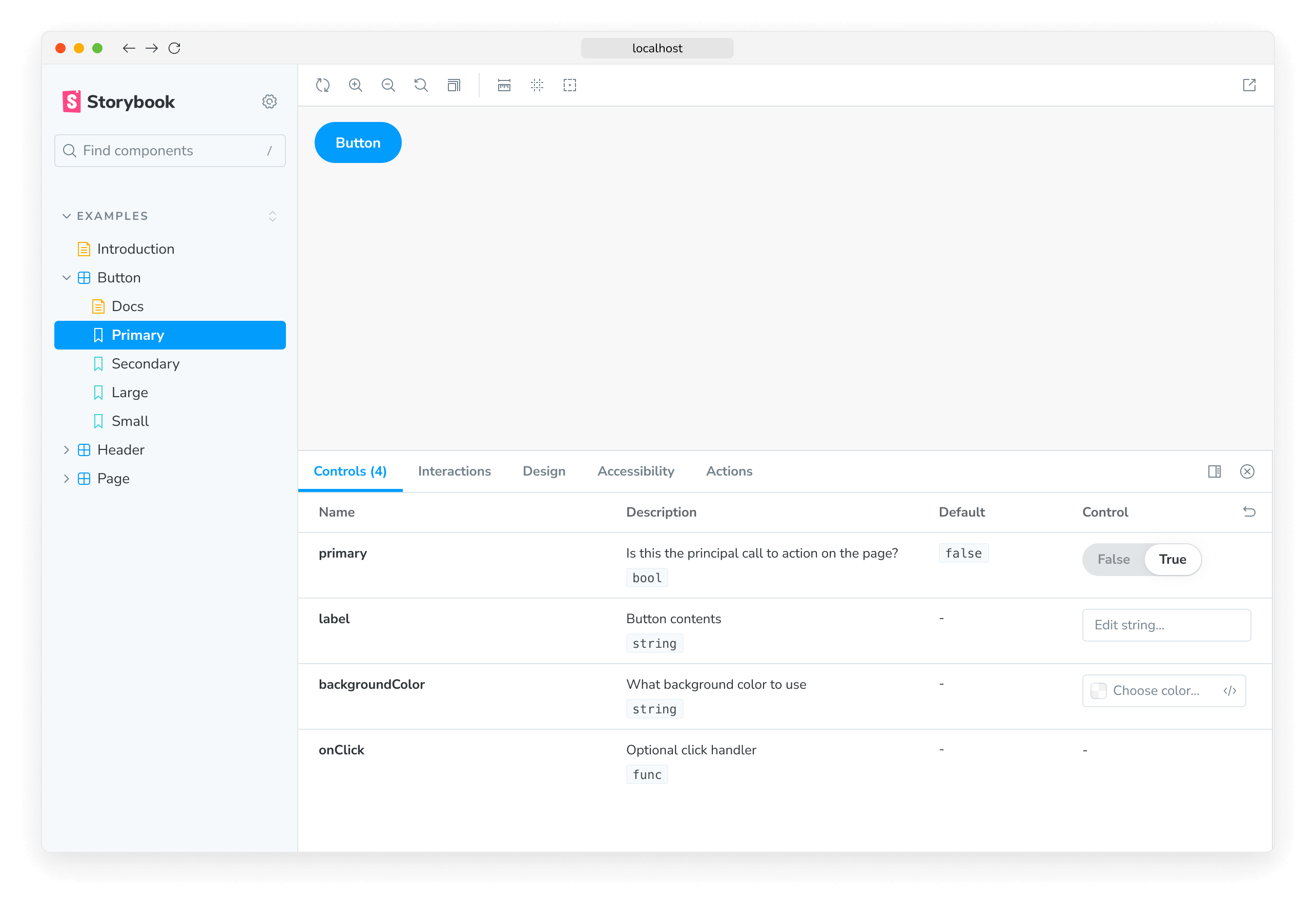
本指南中建置的 addon 是基於 UI 的 addon,特別是 工具列 addon,讓使用者能夠透過快捷方式或按一下按鈕,在 story 中的每個元素周圍繪製外框。UI addons 可以建立其他類型的 UI 元素,每種類型都有其功能:面板和 分頁,為使用者提供各種與 UI 互動的方式。
import React, { memo, useCallback, useEffect } from 'react';

import { useGlobals, useStorybookApi } from '@storybook/manager-api';
import { IconButton } from '@storybook/components';
import { LightningIcon } from '@storybook/icons';

import { ADDON_ID, PARAM_KEY, TOOL_ID } from './constants';

export const Tool = memo(function MyAddonSelector() {
  const [globals, updateGlobals] = useGlobals();
  const api = useStorybookApi();

  const isActive = [true, 'true'].includes(globals[PARAM_KEY]);

  const toggleMyTool = useCallback(() => {
    updateGlobals({
      [PARAM_KEY]: !isActive,
    });
  }, [isActive]);

  useEffect(() => {
    api.setAddonShortcut(ADDON_ID, {
      label: 'Toggle Measure [O]',
      defaultShortcut: ['O'],
      actionName: 'outline',
      showInMenu: false,
      action: toggleMyTool,
    });
  }, [toggleMyTool, api]);

  return (
    <IconButton key={TOOL_ID} active={isActive} title="Enable my addon" onClick={toggleMyTool}>
      <LightningIcon />
    </IconButton>
  );
});
設定
若要建立您的第一個 addon,您將使用 Addon Kit,這是一個隨時可用的範本,其中包含所有必要的建構區塊、相依性和組態,以協助您開始建置您的 addon。在 Addon Kit 儲存庫中,按一下 Use this template 按鈕,以根據 Addon Kit 的程式碼建立新的儲存庫。
複製您剛才建立的儲存庫,並安裝其相依性。當安裝程序完成時,系統會提示您回答問題以設定您的 addon。回答這些問題,當您準備好開始建置您的 addon 時,執行以下命令以在開發模式下啟動 Storybook,並在監看模式下開發您的 addon
npm run startAddon Kit 預設使用 Typescript。如果您想改用 JavaScript,您可以執行 eject-ts 命令將專案轉換為 JavaScript。
瞭解建置系統
在 Storybook 生態系統中建置的 Addons 依賴 tsup,這是一個快速、零設定的 bundler,由 esbuild 提供技術支援,可將您的 addon 程式碼轉譯為現代 JavaScript,使其能在瀏覽器中執行。Addon Kit 開箱即用,隨附預先設定的 tsup 組態檔,您可以使用它來自訂 addon 的建置程序。
當建置腳本執行時,它會尋找組態檔,並根據提供的組態預先捆綁 addon 的程式碼。Addons 可以透過各種方式與 Storybook 互動。它們可以定義 presets 來修改組態、將行為新增至管理 UI,或將行為新增至預覽 iframe。這些不同的使用案例需要不同的捆綁輸出,因為它們的目標是不同的執行階段和環境。Presets 在 Node 環境中執行。Storybook 的管理和預覽環境在全域範圍內提供某些套件,因此 addons 不需要捆綁它們,也不需要將它們包含為其 package.json 檔案中的相依性。
tsup 組態預設會處理這些複雜性,但您可以根據其需求自訂它。如需詳細說明使用的捆綁技術,請參閱 addon-kit 的 README,並查看預設的 tsup 組態 此處。
註冊 Addon
預設情況下,基於 UI 的 addons 程式碼位於以下其中一個檔案中,具體取決於建置的 addon 類型:src/Tool.tsx、src/Panel.tsx 或 src/Tab.tsx。由於我們正在建置工具列 addon,因此我們可以安全地移除 Panel 和 Tab 檔案,並將剩餘檔案更新為以下內容
import React, { memo, useCallback, useEffect } from 'react';

import { useGlobals, useStorybookApi } from '@storybook/manager-api';
import { IconButton } from '@storybook/components';
import { LightningIcon } from '@storybook/icons';

import { ADDON_ID, PARAM_KEY, TOOL_ID } from './constants';

export const Tool = memo(function MyAddonSelector() {
  const [globals, updateGlobals] = useGlobals();
  const api = useStorybookApi();

  const isActive = [true, 'true'].includes(globals[PARAM_KEY]);

  const toggleMyTool = useCallback(() => {
    updateGlobals({
      [PARAM_KEY]: !isActive,
    });
  }, [isActive]);

  useEffect(() => {
    api.setAddonShortcut(ADDON_ID, {
      label: 'Toggle Addon [8]',
      defaultShortcut: ['8'],
      actionName: 'myaddon',
      showInMenu: false,
      action: toggleMyTool,
    });
  }, [toggleMyTool, api]);

  return (
    <IconButton key={TOOL_ID} active={isActive} title="Enable my addon" onClick={toggleMyTool}>
      <LightningIcon />
    </IconButton>
  );
});
依序瀏覽程式碼區塊
import { useGlobals, useStorybookApi } from '@storybook/manager-api';
import { IconButton } from '@storybook/components';
import { LightningIcon } from '@storybook/icons';
來自 manager-api 套件的 useGlobals 和 useStorybookApi hooks 用於存取 Storybook 的 API,讓使用者能夠與 addon 互動,例如啟用或停用它。
來自 @storybook/components 套件的 IconButton 或 Button 元件可用於在工具列中呈現按鈕。@storybook/icons 套件提供大量尺寸和樣式適當的圖示可供選擇。
export const Tool = memo(function MyAddonSelector() {
  const [globals, updateGlobals] = useGlobals();
  const api = useStorybookApi();

  const isActive = [true, 'true'].includes(globals[PARAM_KEY]);

  const toggleMyTool = useCallback(() => {
    updateGlobals({
      [PARAM_KEY]: !isActive,
    });
  }, [isActive]);

  useEffect(() => {
    api.setAddonShortcut(ADDON_ID, {
      label: 'Toggle Addon [8]',
      defaultShortcut: ['8'],
      actionName: 'myaddon',
      showInMenu: false,
      action: toggleMyTool,
    });
  }, [toggleMyTool, api]);

  return (
    <IconButton key={TOOL_ID} active={isActive} title="Enable my addon" onClick={toggleMyTool}>
      <LightningIcon />
    </IconButton>
  );
});
Tool 元件是 addon 的進入點。它在工具列中呈現 UI 元素、註冊鍵盤快捷鍵,並處理啟用和停用 addon 的邏輯。
接下來是 manager,我們在此處向 Storybook 註冊 addon,並使用唯一的名稱和識別碼。由於我們已移除 Panel 和 Tab 檔案,因此我們需要調整檔案以僅參考我們正在建置的 addon。
import { addons, types } from '@storybook/manager-api';
import { ADDON_ID, TOOL_ID } from './constants';
import { Tool } from './Tool';

// Register the addon
addons.register(ADDON_ID, () => {
  // Register the tool
  addons.add(TOOL_ID, {
    type: types.TOOL,
    title: 'My addon',
    match: ({ tabId, viewMode }) => !tabId && viewMode === 'story',
    render: Tool,
  });
});
有條件地呈現 Addon
請注意 match 屬性。它可讓您控制檢視模式(story 或文件)和分頁(story 畫布或 自訂分頁),工具列 addon 在其中可見。例如
({ tabId }) => tabId === 'my-addon/tab'將在檢視 ID 為my-addon/tab的分頁時顯示您的 addon。({ viewMode }) => viewMode === 'story'將在畫布中檢視 story 時顯示您的 addon。({ viewMode }) => viewMode === 'docs'將在檢視元件的文件時顯示您的 addon。({ tabId, viewMode }) => !tabId && viewMode === 'story'將在畫布中檢視 story 且不在自訂分頁中時顯示您的 addon(即當tabId === undefined時)。
執行 start 腳本以建置並啟動 Storybook,並驗證 addon 是否已正確註冊並顯示在 UI 中。
設定 Addon 樣式
在 Storybook 中,為 addons 應用樣式被視為副作用。因此,我們需要對我們的 addon 進行一些變更,使其能夠在啟用時使用樣式,並在停用時移除樣式。我們將依賴 Storybook 的兩個功能來處理此問題:decorators 和 globals。若要處理 CSS 邏輯,我們必須包含一些輔助函式,以從 DOM 注入和移除樣式表。首先建立包含以下內容的輔助檔案
import { global } from '@storybook/global';

export const clearStyles = (selector: string | string[]) => {
  const selectors = Array.isArray(selector) ? selector : [selector];
  selectors.forEach(clearStyle);
};

const clearStyle = (input: string | string[]) => {
  const selector = typeof input === 'string' ? input : input.join('');
  const element = global.document.getElementById(selector);
  if (element && element.parentElement) {
    element.parentElement.removeChild(element);
  }
};

export const addOutlineStyles = (selector: string, css: string) => {
  const existingStyle = global.document.getElementById(selector);
  if (existingStyle) {
    if (existingStyle.innerHTML !== css) {
      existingStyle.innerHTML = css;
    }
  } else {
    const style = global.document.createElement('style');
    style.setAttribute('id', selector);
    style.innerHTML = css;
    global.document.head.appendChild(style);
  }
};
接下來,建立檔案,其中包含我們想要注入的樣式,內容如下
import { dedent } from 'ts-dedent';

export default function outlineCSS(selector: string) {
  return dedent/* css */ `
    ${selector} body {
      outline: 1px solid #2980b9 !important;
    }

    ${selector} article {
      outline: 1px solid #3498db !important;
    }

    ${selector} nav {
      outline: 1px solid #0088c3 !important;
    }

    ${selector} aside {
      outline: 1px solid #33a0ce !important;
    }

    ${selector} section {
      outline: 1px solid #66b8da !important;
    }

    ${selector} header {
      outline: 1px solid #99cfe7 !important;
    }

    ${selector} footer {
      outline: 1px solid #cce7f3 !important;
    }

    ${selector} h1 {
      outline: 1px solid #162544 !important;
    }

    ${selector} h2 {
      outline: 1px solid #314e6e !important;
    }

    ${selector} h3 {
      outline: 1px solid #3e5e85 !important;
    }

    ${selector} h4 {
      outline: 1px solid #449baf !important;
    }

    ${selector} h5 {
      outline: 1px solid #c7d1cb !important;
    }

    ${selector} h6 {
      outline: 1px solid #4371d0 !important;
    }

    ${selector} main {
      outline: 1px solid #2f4f90 !important;
    }

    ${selector} address {
      outline: 1px solid #1a2c51 !important;
    }

    ${selector} div {
      outline: 1px solid #036cdb !important;
    }

    ${selector} p {
      outline: 1px solid #ac050b !important;
    }

    ${selector} hr {
      outline: 1px solid #ff063f !important;
    }

    ${selector} pre {
      outline: 1px solid #850440 !important;
    }

    ${selector} blockquote {
      outline: 1px solid #f1b8e7 !important;
    }

    ${selector} ol {
      outline: 1px solid #ff050c !important;
    }

    ${selector} ul {
      outline: 1px solid #d90416 !important;
    }

    ${selector} li {
      outline: 1px solid #d90416 !important;
    }

    ${selector} dl {
      outline: 1px solid #fd3427 !important;
    }

    ${selector} dt {
      outline: 1px solid #ff0043 !important;
    }

    ${selector} dd {
      outline: 1px solid #e80174 !important;
    }

    ${selector} figure {
      outline: 1px solid #ff00bb !important;
    }

    ${selector} figcaption {
      outline: 1px solid #bf0032 !important;
    }

    ${selector} table {
      outline: 1px solid #00cc99 !important;
    }

    ${selector} caption {
      outline: 1px solid #37ffc4 !important;
    }

    ${selector} thead {
      outline: 1px solid #98daca !important;
    }

    ${selector} tbody {
      outline: 1px solid #64a7a0 !important;
    }

    ${selector} tfoot {
      outline: 1px solid #22746b !important;
    }

    ${selector} tr {
      outline: 1px solid #86c0b2 !important;
    }

    ${selector} th {
      outline: 1px solid #a1e7d6 !important;
    }

    ${selector} td {
      outline: 1px solid #3f5a54 !important;
    }

    ${selector} col {
      outline: 1px solid #6c9a8f !important;
    }

    ${selector} colgroup {
      outline: 1px solid #6c9a9d !important;
    }

    ${selector} button {
      outline: 1px solid #da8301 !important;
    }

    ${selector} datalist {
      outline: 1px solid #c06000 !important;
    }

    ${selector} fieldset {
      outline: 1px solid #d95100 !important;
    }

    ${selector} form {
      outline: 1px solid #d23600 !important;
    }

    ${selector} input {
      outline: 1px solid #fca600 !important;
    }

    ${selector} keygen {
      outline: 1px solid #b31e00 !important;
    }

    ${selector} label {
      outline: 1px solid #ee8900 !important;
    }

    ${selector} legend {
      outline: 1px solid #de6d00 !important;
    }

    ${selector} meter {
      outline: 1px solid #e8630c !important;
    }

    ${selector} optgroup {
      outline: 1px solid #b33600 !important;
    }

    ${selector} option {
      outline: 1px solid #ff8a00 !important;
    }

    ${selector} output {
      outline: 1px solid #ff9619 !important;
    }

    ${selector} progress {
      outline: 1px solid #e57c00 !important;
    }

    ${selector} select {
      outline: 1px solid #e26e0f !important;
    }

    ${selector} textarea {
      outline: 1px solid #cc5400 !important;
    }

    ${selector} details {
      outline: 1px solid #33848f !important;
    }

    ${selector} summary {
      outline: 1px solid #60a1a6 !important;
    }

    ${selector} command {
      outline: 1px solid #438da1 !important;
    }

    ${selector} menu {
      outline: 1px solid #449da6 !important;
    }

    ${selector} del {
      outline: 1px solid #bf0000 !important;
    }

    ${selector} ins {
      outline: 1px solid #400000 !important;
    }

    ${selector} img {
      outline: 1px solid #22746b !important;
    }

    ${selector} iframe {
      outline: 1px solid #64a7a0 !important;
    }

    ${selector} embed {
      outline: 1px solid #98daca !important;
    }

    ${selector} object {
      outline: 1px solid #00cc99 !important;
    }

    ${selector} param {
      outline: 1px solid #37ffc4 !important;
    }

    ${selector} video {
      outline: 1px solid #6ee866 !important;
    }

    ${selector} audio {
      outline: 1px solid #027353 !important;
    }

    ${selector} source {
      outline: 1px solid #012426 !important;
    }

    ${selector} canvas {
      outline: 1px solid #a2f570 !important;
    }

    ${selector} track {
      outline: 1px solid #59a600 !important;
    }

    ${selector} map {
      outline: 1px solid #7be500 !important;
    }

    ${selector} area {
      outline: 1px solid #305900 !important;
    }

    ${selector} a {
      outline: 1px solid #ff62ab !important;
    }

    ${selector} em {
      outline: 1px solid #800b41 !important;
    }

    ${selector} strong {
      outline: 1px solid #ff1583 !important;
    }

    ${selector} i {
      outline: 1px solid #803156 !important;
    }

    ${selector} b {
      outline: 1px solid #cc1169 !important;
    }

    ${selector} u {
      outline: 1px solid #ff0430 !important;
    }

    ${selector} s {
      outline: 1px solid #f805e3 !important;
    }

    ${selector} small {
      outline: 1px solid #d107b2 !important;
    }

    ${selector} abbr {
      outline: 1px solid #4a0263 !important;
    }

    ${selector} q {
      outline: 1px solid #240018 !important;
    }

    ${selector} cite {
      outline: 1px solid #64003c !important;
    }

    ${selector} dfn {
      outline: 1px solid #b4005a !important;
    }

    ${selector} sub {
      outline: 1px solid #dba0c8 !important;
    }

    ${selector} sup {
      outline: 1px solid #cc0256 !important;
    }

    ${selector} time {
      outline: 1px solid #d6606d !important;
    }

    ${selector} code {
      outline: 1px solid #e04251 !important;
    }

    ${selector} kbd {
      outline: 1px solid #5e001f !important;
    }

    ${selector} samp {
      outline: 1px solid #9c0033 !important;
    }

    ${selector} var {
      outline: 1px solid #d90047 !important;
    }

    ${selector} mark {
      outline: 1px solid #ff0053 !important;
    }

    ${selector} bdi {
      outline: 1px solid #bf3668 !important;
    }

    ${selector} bdo {
      outline: 1px solid #6f1400 !important;
    }

    ${selector} ruby {
      outline: 1px solid #ff7b93 !important;
    }

    ${selector} rt {
      outline: 1px solid #ff2f54 !important;
    }

    ${selector} rp {
      outline: 1px solid #803e49 !important;
    }

    ${selector} span {
      outline: 1px solid #cc2643 !important;
    }

    ${selector} br {
      outline: 1px solid #db687d !important;
    }

    ${selector} wbr {
      outline: 1px solid #db175b !important;
    }`;
}
由於 addon 可以在 story 和文件模式下都處於活動狀態,因此 Storybook 預覽 iframe 的 DOM 節點在這兩種模式下是不同的。實際上,當處於文件模式時,Storybook 在一個頁面上呈現多個 story 預覽。因此,我們需要為 DOM 節點選擇正確的選取器,樣式將注入到該節點中,並確保 CSS 的範圍限定於該特定選取器。該機制在 src/withGlobals.ts 檔案中作為範例提供,我們將使用它將樣式和輔助函式連接到 addon 邏輯。將檔案更新為以下內容
import type { Renderer, PartialStoryFn as StoryFunction, StoryContext } from '@storybook/types';

import { useEffect, useMemo, useGlobals } from '@storybook/preview-api';
import { PARAM_KEY } from './constants';

import { clearStyles, addOutlineStyles } from './helpers';

import outlineCSS from './outlineCSS';

export const withGlobals = (StoryFn: StoryFunction<Renderer>, context: StoryContext<Renderer>) => {
  const [globals] = useGlobals();

  const isActive = [true, 'true'].includes(globals[PARAM_KEY]);

  // Is the addon being used in the docs panel
  const isInDocs = context.viewMode === 'docs';

  const outlineStyles = useMemo(() => {
    const selector = isInDocs ? `#anchor--${context.id} .docs-story` : '.sb-show-main';

    return outlineCSS(selector);
  }, [context.id]);
  useEffect(() => {
    const selectorId = isInDocs ? `my-addon-docs-${context.id}` : `my-addon`;

    if (!isActive) {
      clearStyles(selectorId);
      return;
    }

    addOutlineStyles(selectorId, outlineStyles);

    return () => {
      clearStyles(selectorId);
    };
  }, [isActive, outlineStyles, context.id]);

  return StoryFn();
};
封裝與發佈
Storybook addons 與 JavaScript 生態系統中的大多數套件類似,以 NPM 套件形式發佈。但是,它們有特定的標準需要滿足,才能發佈到 NPM 並由整合 catalog 爬取
- 具有包含轉譯程式碼的
dist資料夾。 - 宣告
package.json檔案- 模組相關資訊
- 整合 catalog metadata
模組 Metadata
第一類 metadata 與 addon 本身相關。這包括模組的進入點、發佈 addon 時要包含的檔案。以及將 addon 與 Storybook 整合所需的組態,使其能夠被其使用者使用。
{
  "exports": {
    ".": {
      "types": "./dist/index.d.ts",
      "node": "./dist/index.js",
      "require": "./dist/index.js",
      "import": "./dist/index.mjs"
    },
    "./manager": "./dist/manager.mjs",
    "./preview": "./dist/preview.mjs",
    "./package.json": "./package.json"
  },
  "main": "dist/index.js",
  "module": "dist/index.mjs",
  "types": "dist/index.d.ts",
  "files": ["dist/**/*", "README.md", "*.js", "*.d.ts"],
  "devDependencies": {
    "@storybook/blocks": "^7.0.0",
    "@storybook/components": "^7.0.0",
    "@storybook/core-events": "^7.0.0",
    "@storybook/manager-api": "^7.0.0",
    "@storybook/preview-api": "^7.0.0",
    "@storybook/theming": "^7.0.0",
    "@storybook/types": "^7.0.0"
  },
  "bundler": {
    "exportEntries": ["src/index.ts"],
    "managerEntries": ["src/manager.ts"],
    "previewEntries": ["src/preview.ts"]
  }
}
整合 Catalog Metadata
第二類 metadata 與 整合 catalog 相關。大多數此資訊已由 Addon Kit 預先設定。但是,顯示名稱、圖示和框架等項目必須透過 storybook 屬性進行設定,才能顯示在 catalog 中。
{
  "name": "my-storybook-addon",
  "version": "1.0.0",
  "description": "My first storybook addon",
  "author": "Your Name",
  "storybook": {
    "displayName": "My Storybook Addon",
    "unsupportedFrameworks": ["react-native"],
    "icon": "https://yoursite.com/link-to-your-icon.png"
  },
  "keywords": ["storybook-addons", "appearance", "style", "css", "layout", "debug"]
}storybook 組態元素包含其他屬性,有助於自訂 addon 的可搜尋性和索引。如需更多資訊,請參閱 整合 catalog 文件。
需要注意的一個重要項目是 keywords 屬性,因為它對應到 catalog 的標籤系統。新增 storybook-addons 可確保在搜尋 addons 時,addon 可在 catalog 中被發現。剩餘的關鍵字有助於 addon 的可搜尋性和分類。
發佈至 NPM
當您準備好將您的 addon 發佈到 NPM 時,Addon Kit 預先設定了 Auto 套件以進行發佈管理。它會自動產生更新日誌,並將套件上傳到 NPM 和 GitHub。因此,您需要設定對兩者的存取權。
- 使用 npm adduser 進行驗證
- 產生具有
read和publish權限的 存取權杖。 - 建立具有
repo和workflow範圍權限的 個人存取權杖。 - 在專案根目錄中建立
.env檔案,並新增以下內容
GH_TOKEN=value_you_just_got_from_github
NPM_TOKEN=value_you_just_got_from_npm
接下來,執行以下命令以在 GitHub 上建立標籤。您將使用這些標籤來分類對套件的變更。
npx auto create-labels最後,執行以下命令以建立 addon 的發佈版本。這將建置和封裝 addon 程式碼、遞增版本、將發佈版本推送至 GitHub 和 npm,並產生更新日誌。
npm run releaseCI 自動化
預設情況下,Addon Kit 預先設定了 GitHub Actions 工作流程,讓您能夠自動化發佈管理程序。這可確保套件始終與最新的變更保持同步,並且更新日誌也會相應地更新。但是,您需要額外的組態才能使用您的 NPM 和 GitHub 權杖成功發佈套件。在您的儲存庫中,按一下 Settings 標籤,然後按一下 Secrets and variables 下拉式選單,接著按一下 Actions 項目。您應該會看到以下畫面
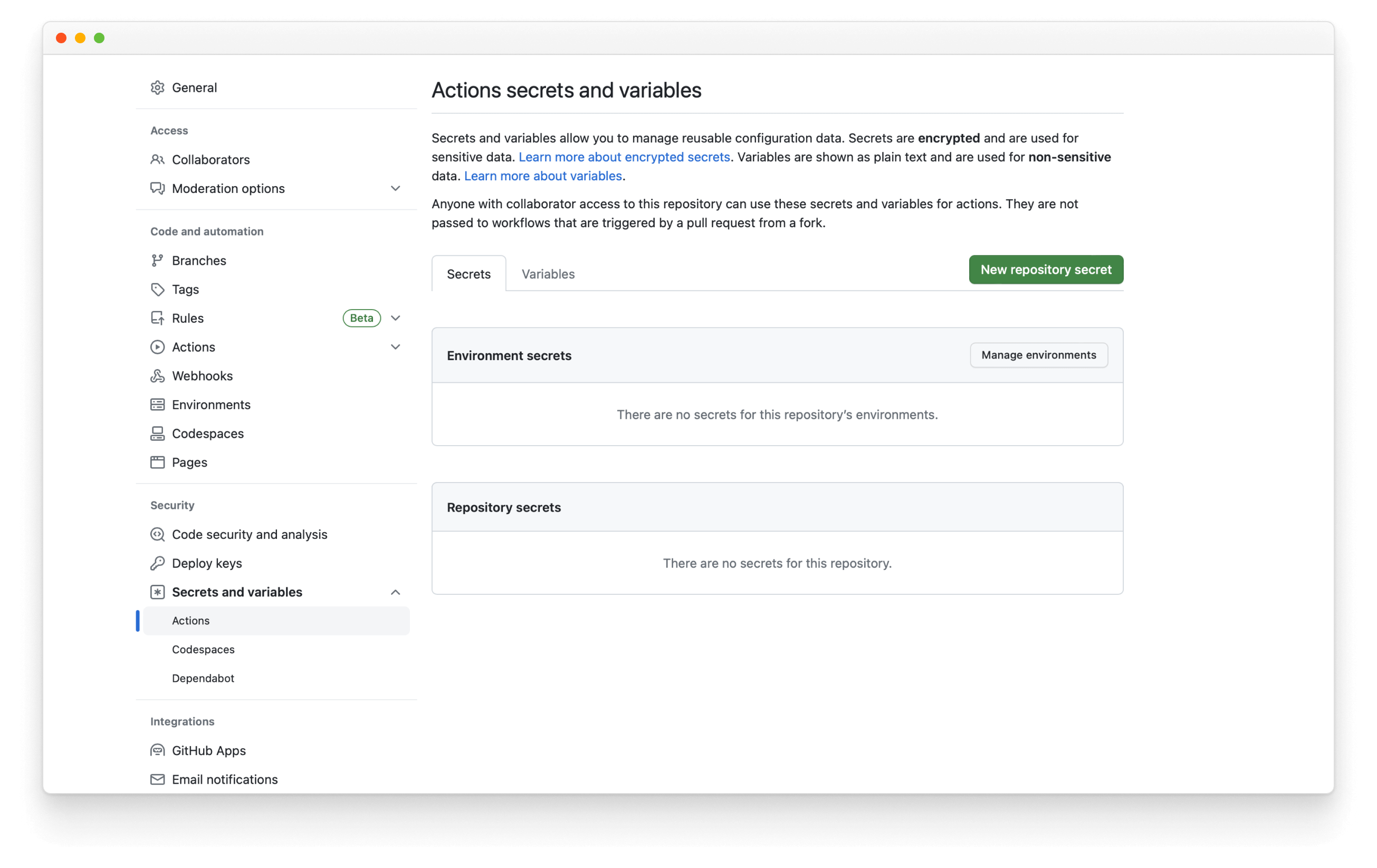
然後,按一下 New repository secret,將其命名為 NPM_TOKEN,並貼上您稍早產生的權杖。每當您將提取請求合併到預設分支時,工作流程就會執行並發佈新的發佈版本,自動遞增版本號碼並更新更新日誌。
深入瞭解 Storybook addon 生態系統
- Addons 類型,以瞭解其他類型的 addons
- 撰寫 addons,以瞭解 addon 開發的基礎知識
- Presets,以瞭解 preset 開發
- 整合 catalog,以瞭解需求和可用的配方
- API 參考,以瞭解可用的 API