Storybook 擴充功能 Material-UI
提供開發環境,協助建立 Material-UI 元件。這是 React Storybook 的擴充功能,它將您的元件包裝在 MuiThemeProvider 中。這加速並簡化了基於 Material-UI 的應用程式的開發流程。
您可以使用這個專案的演示頁面,探索任何元件的 Material-UI 主題設定,並直接在線上建立您自己的新主題。但若要充分利用此專案,請在您的工作環境中在本機執行它。
功能
- 包裝在主題提供器中。只需從基本淺色主題開始開發。
- 注入 TapEvent 外掛程式。在行動裝置上測試。
- 切換主題。一鍵查看其外觀。
- 建立您的自訂主題。透過程式碼或視覺編輯器。
- 動態視覺主題編輯。探索所有可用的主題屬性。
- Google material color 調色盤 選擇器
- 儲存所做的變更並下載為 JSON 檔案
- 屬於 React Theming 的一部分。建立可主題化的 React 元件。
- 適用於 Storybook 3.0
快速開始
為了快速開始使用最新的 storybook-addon-material-ui,您可以查看 create-material-ui-app
它包含以下的工作設定:
- create-react-app
- Storybook
- Material-UI
- storybook-addon-material-ui
開始使用
首先,安裝擴充功能
npm i storybook-addon-material-ui --save-dev
Storybook 6.1
將 storybook-addon-material-ui 新增至 storybook 擴充功能
//.storybook/main.js

module.exports = {
  stories: ['../stories/**/*.stories.(js|mdx)'],
  addons: [
    'storybook-addon-material-ui'
  ],
};
將裝飾器新增至 storybook 預覽
//.storybook/preview.js

import { muiTheme } from 'storybook-addon-material-ui'

export const decorators = [
	muiTheme()
];
注意:您可以在已載入的主題之間切換。您開箱即用就有兩個基本主題,但您可以像這樣簡單地新增自訂主題
//.storybook/preview.js

import { muiTheme } from 'storybook-addon-material-ui'

// Create your own theme like this.
// Note: you can specify theme name in `themeName` field. Otherwise it will be displayed by the number.
// you can specify only required fields overriding the `Light Base Theme`
const newTheme = {
    themeName: 'Grey Theme',
    palette: {
        primary1Color: '#00bcd4',
        alternateTextColor: '#4a4a4a',
        canvasColor: '#616161',
        textColor: '#bdbdbd',
        secondaryTextColor: 'rgba(255, 255, 255, 0.54)',
        disabledColor: '#757575',
        accent1Color: '#607d8b',
    },
};


export const decorators = [
	muiTheme([newTheme])
];
甚至從其他地方匯入
//.storybook/preview.js

import { muiTheme } from 'storybook-addon-material-ui'

import theme1 from './src/theme/theme1'
import theme2 from './src/theme/theme2'

export const decorators = [
	muiTheme([theme1, theme2])
];
Storybook 5(和舊版本)
現在,使用 Material-UI 擴充功能編寫您的故事。預設情況下,您的故事將會提供 淺色基本主題 和 深色基本主題
import React from 'react';
import { storiesOf, addDecorator } from '@storybook/react';
import {muiTheme} from 'storybook-addon-material-ui';
// Import some examples from react-theming https://github.com/react-theming/react-theme-provider/blob/master/example/
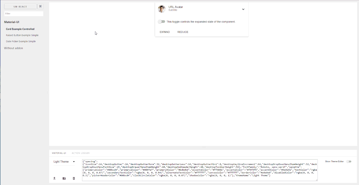
import CardExampleControlled from '../CardExampleControlled.jsx';
import RaisedButtonExampleSimple from '../RaisedButtonExampleSimple.jsx';
import DatePickerExampleSimple from '../DatePickerExampleSimple.jsx';
storiesOf('Material-UI', module)
// Add the `muiTheme` decorator to provide material-ui support to your stories.
// If you do not specify any arguments it starts with two default themes
// You can also configure `muiTheme` as a global decorator.
.addDecorator(muiTheme())
.add('Card Example Controlled', () => (
<CardExampleControlled />
))
.add('Raised Button Example Simple', () => (
<RaisedButtonExampleSimple />
))
.add('Date Picker Example Simple', () => (
<DatePickerExampleSimple />
));
注意:您可以在已載入的主題之間切換。您開箱即用就有兩個基本主題,但您可以像這樣簡單地新增自訂主題
import React from 'react';
import { storiesOf, addDecorator } from '@storybook/react';

import {muiTheme} from 'storybook-addon-material-ui';

import CardExampleControlled from '../CardExampleControlled.jsx';
import RaisedButtonExampleSimple from '../RaisedButtonExampleSimple.jsx';
import DatePickerExampleSimple from '../DatePickerExampleSimple.jsx';

// Create your own theme like this.
// Note: you can specify theme name in `themeName` field. Otherwise it will be displayed by the number.
// you can specify only required fields overriding the `Light Base Theme`
const newTheme = {
    themeName: 'Grey Theme',
    palette: {
        primary1Color: '#00bcd4',
        alternateTextColor: '#4a4a4a',
        canvasColor: '#616161',
        textColor: '#bdbdbd',
        secondaryTextColor: 'rgba(255, 255, 255, 0.54)',
        disabledColor: '#757575',
        accent1Color: '#607d8b',
    },
};


storiesOf('Material-UI', module)
    .addDecorator(muiTheme([newTheme]))
    .add('Card Example Controlled', () => (
            <CardExampleControlled />
        ))
    .add('Raised Button Example Simple', () => (
            <RaisedButtonExampleSimple />
        ))
    .add('Date Picker Example Simple', () => (
            <DatePickerExampleSimple />
        ));
意見回饋
您可以透過匿名問卷調查留下您對此專案的意見。
查詢字串參數
當您選擇主題和其他選項時,它會儲存在網址列中。因此,當您重新整理頁面時,此狀態會保留下來,而且您可以使用直接連結到所需的狀態。
https://127.0.0.1:9001/?theme-ind=0&theme-sidebar=true&theme-full=true
貢獻
開發人員
我們的團隊歡迎所有貢獻、測試、錯誤修正。如果您想協助貢獻此專案,請隨時建立 Issue、PR 或與我聯繫。
設計人員
我們非常歡迎設計人員參與此專案。我們對您使用此工具的意見、設計人員和開發人員共同工作的可能性以及其外觀和功能非常感興趣
