
擴充功能類型
每個 Storybook 擴充功能都分為兩種主要類別:基於 UI 或預設集。此處記錄了每種類型的擴充功能特色。在建立您的擴充功能時,請以此作為參考。
基於 UI 的擴充功能
基於 UI 的擴充功能可讓您使用以下元素自訂 Storybook 的 UI。
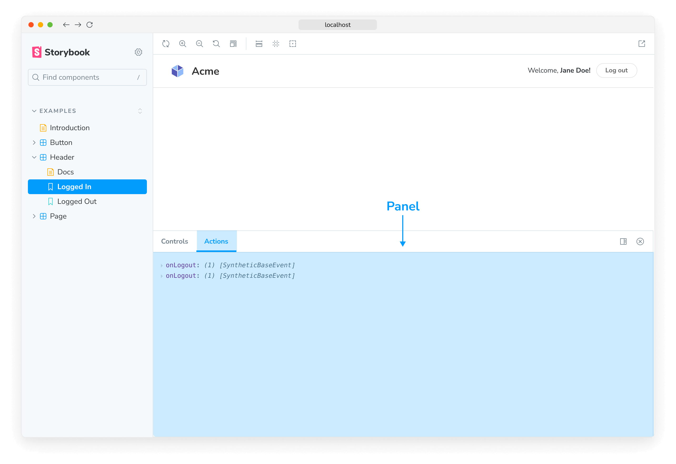
面板
面板擴充功能可讓您在 Storybook 的擴充功能面板中新增自己的 UI。這是生態系統中最常見的擴充功能類型。例如,官方的 @storybook/actions 和 @storybook/a11y 使用此模式。
使用此樣板程式碼將新的 Panel 新增至 Storybook 的 UI
addon-panel/manager.js
import React from 'react';
import { AddonPanel } from '@storybook/components';
import { useGlobals, addons, types } from '@storybook/manager-api';
addons.register('my/panel', () => {
addons.add('my-panel-addon/panel', {
title: 'Example Storybook panel',
//👇 Sets the type of UI element in Storybook
type: types.PANEL,
render: ({ active }) => (
<AddonPanel active={active}>
<h2>I'm a panel addon in Storybook</h2>
</AddonPanel>
),
});
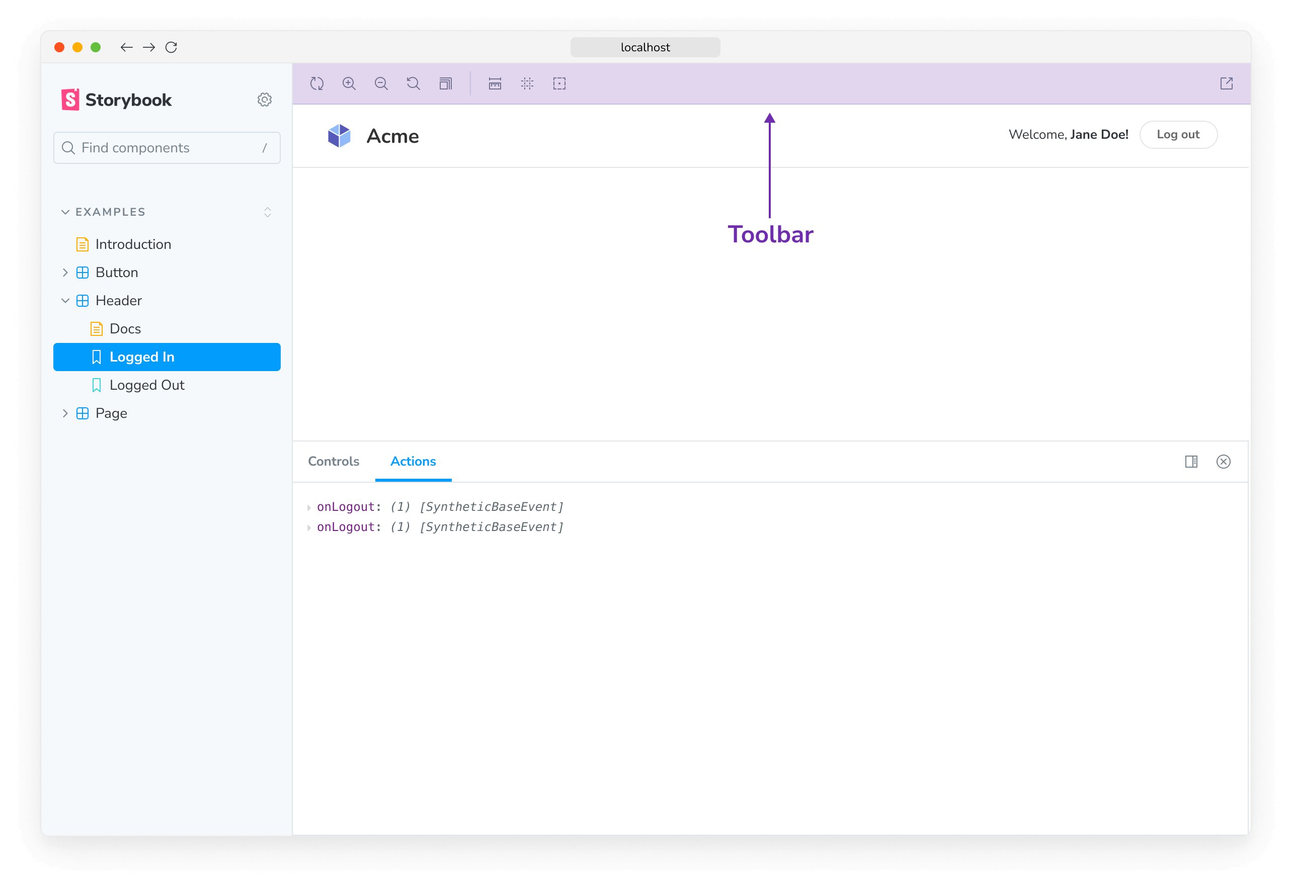
});工具列
工具列擴充功能可讓您在 Storybook 的工具列中新增自己的自訂工具。例如,官方的 @storybook/backgrounds 和 @storybook/addon-outline 使用此模式。
使用此樣板程式碼將新的 button 新增至 Storybook 的工具列
addon-toolbar/manager.js
import React from 'react';

import { addons, types } from '@storybook/manager-api';
import { IconButton } from '@storybook/components';
import { OutlineIcon } from '@storybook/icons';

addons.register('my-addon', () => {
  addons.add('my-addon/toolbar', {
    title: 'Example Storybook toolbar',
    //👇 Sets the type of UI element in Storybook
    type: types.TOOL,
    //👇 Shows the Toolbar UI element if the story canvas is being viewed
    match: ({ tabId, viewMode }) => !tabId && viewMode === 'story',
    render: ({ active }) => (
      <IconButton active={active} title="Show a Storybook toolbar">
        <OutlineIcon />
      </IconButton>
    ),
  });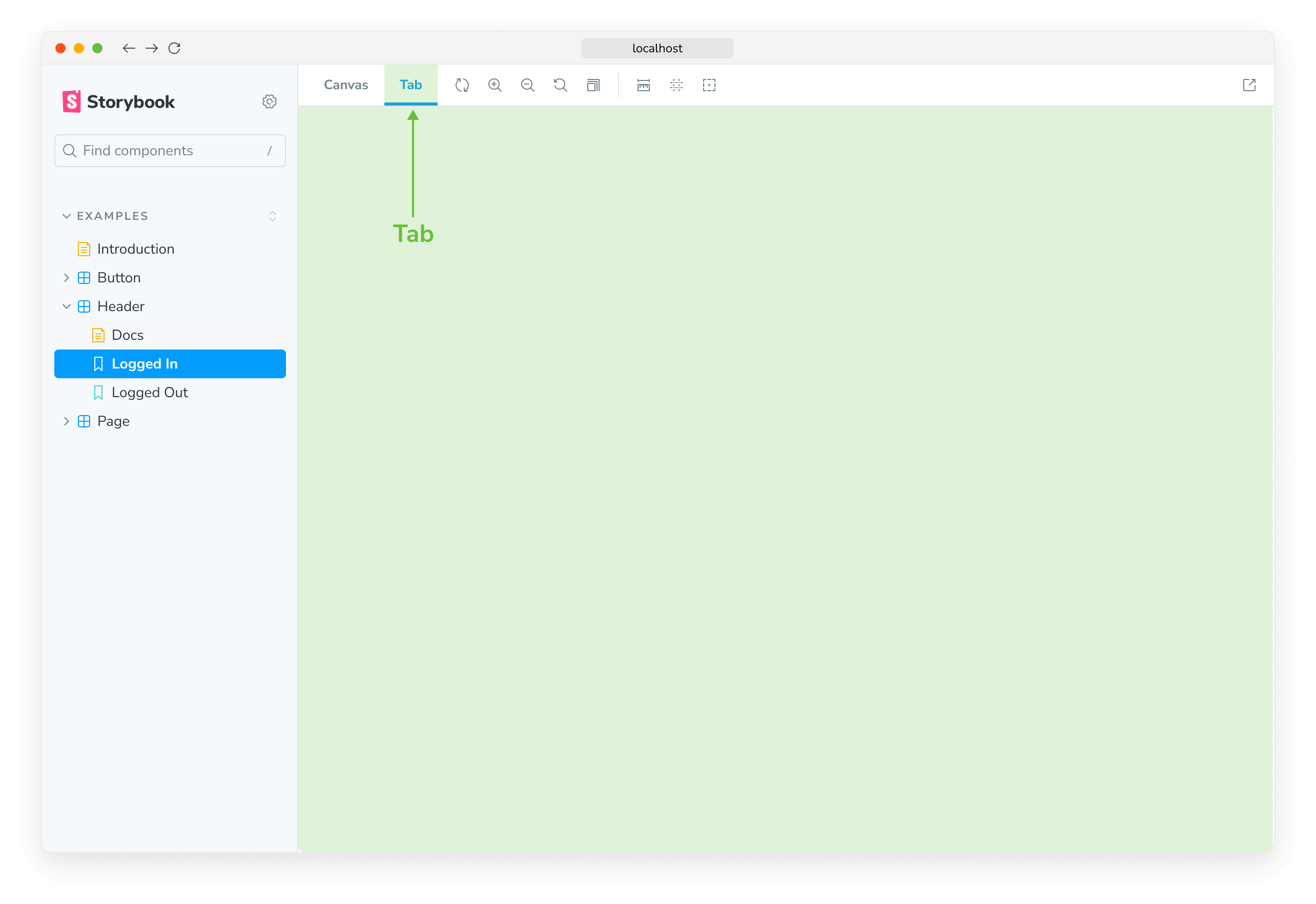
});分頁
分頁擴充功能可讓您在 Storybook 中建立自己的自訂分頁。例如,官方的 @storybook/addon-docs 使用此模式。
使用此樣板程式碼將新的 Tab 新增至 Storybook 的 UI
addon-tab/manager.js
import React from 'react';

import { addons, types } from '@storybook/manager-api';

addons.register('my-addon', () => {
  addons.add('my-addon/tab', {
    type: types.TAB,
    title: 'Example Storybook tab',
    render: () => (
      <div>
        <h2>I'm a tabbed addon in Storybook</h2>
      </div>
    ),
  });
});了解如何撰寫包含這些 UI 元素的自訂擴充功能,請按此處。
預設集擴充功能
Storybook 預設集擴充功能是 babel、webpack 和 addons 設定的群組集合,用於整合 Storybook 和其他技術。例如,官方的 preset-create-react-app。
在撰寫自己的預設集擴充功能時,請使用此樣板程式碼。
.storybook/my-preset.js
export default {
  managerWebpack: async (config, options) => {
    // Update config here
    return config;
  },
  webpackFinal: async (config, options) => {
    return config;
  },
  babel: async (config, options) => {
    return config;
  },
};
深入了解 Storybook 擴充功能生態系統