
Controls
觀看影片教學
Storybook Controls 提供圖形化 UI,讓您動態地與元件的 arguments 互動,而無需編碼。它會在元件範例(「stories」)旁邊建立一個附加元件面板,讓您可以即時編輯它們。
Controls 不需要修改您的元件。Controls 的 Stories 是
- 方便的。根據 React/Vue/Angular/等等元件自動產生 controls。
- 可攜式的。在文件、測試,甚至設計中重複使用您的互動式 stories。
- 豐富的。自訂 controls 和互動式資料以符合您的確切需求。
若要使用 Controls 附加元件,您需要使用 args 撰寫您的 stories。Storybook 會根據您的 args 以及它可以推斷出的元件自動產生 UI controls。儘管如此,您仍然可以使用 argTypes 進一步設定 controls,請參閱下方。
如果您有舊版 pre-Storybook 6 風格的 stories,請查看 args & controls 遷移指南,以了解如何轉換您現有的 stories 以使用 args。
選擇 control 類型
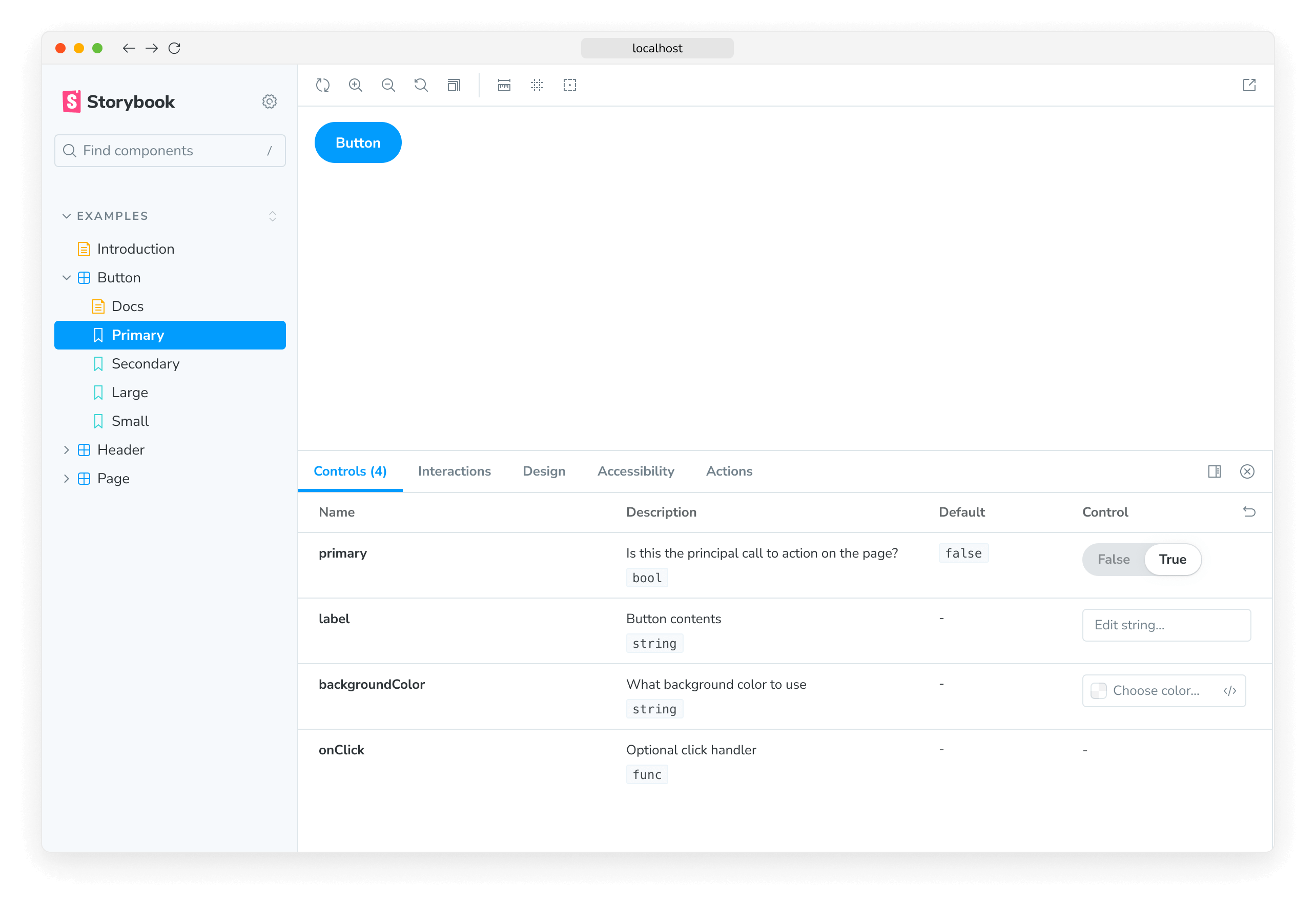
預設情況下,Storybook 會根據每個 arg 的初始值選擇一個 control。這對於特定的 arg 類型(例如,boolean 或 string)效果很好。若要啟用它們,請將 component 註解新增至您的 story 檔案的預設匯出,它將用於推斷 controls 並自動產生符合您元件的 argTypes,使用 react-docgen,這是 React 元件的文件產生器,也包含對 TypeScript 的一流支援。
import type { Meta } from '@storybook/react';

import { Button } from './Button';

const meta: Meta<typeof Button> = {
  component: Button,
};

export default meta;
例如,假設您的 story 上有一個 variant arg,它應該是 primary 或 secondary
// Replace your-framework with the name of your framework
import type { Meta, StoryObj } from '@storybook/your-framework';

import { Button } from './Button';

const meta: Meta<typeof Button> = {
  component: Button,
};

export default meta;
type Story = StoryObj<typeof Button>;

export const Primary: Story = {
  args: {
    variant: 'primary',
  },
};
預設情況下,Storybook 將為 variant arg 渲染一個自由文字輸入框
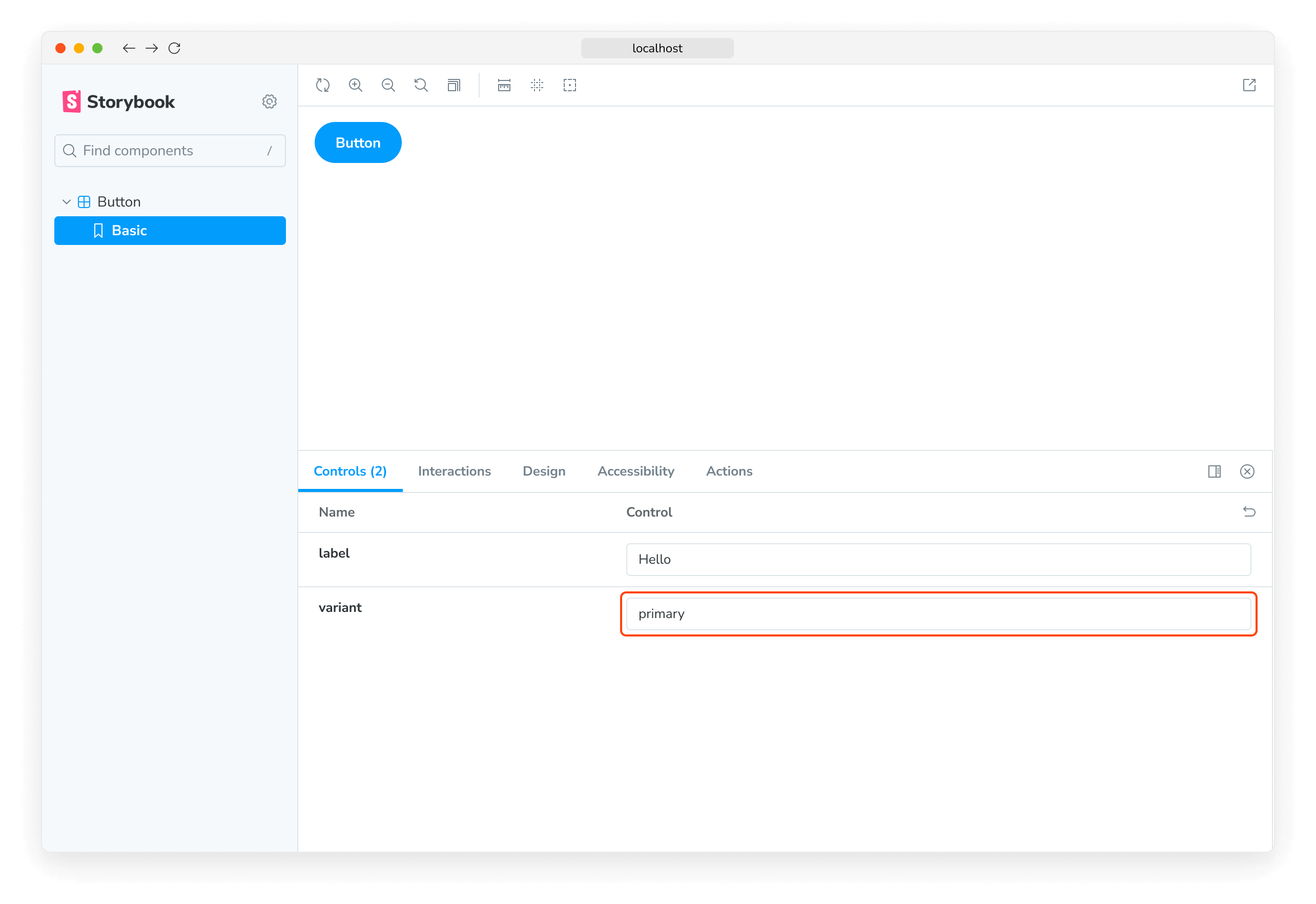
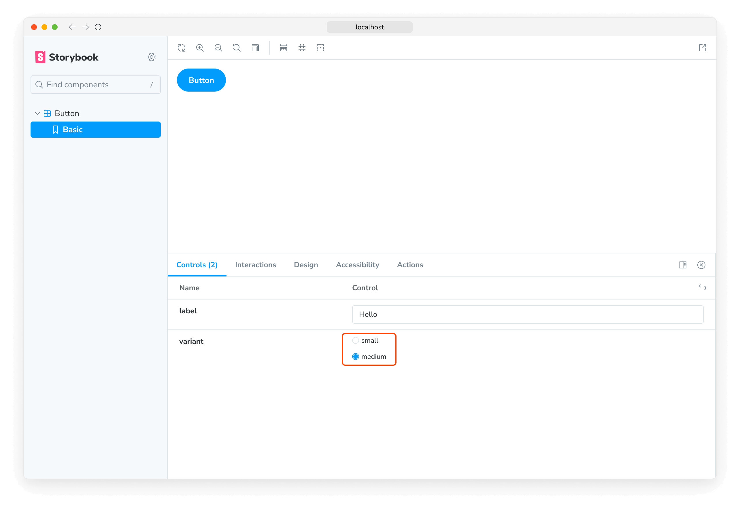
只要您在自動產生的文字 control 中輸入有效的字串,它就可以運作。不過,對於我們的情況來說,這不是最佳的 UI,因為元件僅接受 primary 或 secondary 作為變體。讓我們用 Storybook 的 radio 元件取代它。
我們可以透過為 variant 屬性宣告自訂 argType 來指定要使用哪些 controls。ArgTypes 編碼 args 的基本 metadata,例如 arg 的名稱、描述和 defaultValue。這些會由 Storybook 文件自動填寫。
ArgTypes 也可以包含使用者可以覆寫的任意註解。由於 variant 是元件屬性,因此讓我們將該註解放在預設匯出上。
// Replace your-framework with the name of your framework
import type { Meta } from '@storybook/your-framework';

import { Button } from './Button';

const meta: Meta<typeof Button> = {
  component: Button,
  argTypes: {
    variant: {
      options: ['primary', 'secondary'],
      control: { type: 'radio' },
    },
  },
};

export default meta;ArgTypes 是一項強大的功能,可用於自訂 stories 的 controls。如需更多資訊,請參閱關於使用 argTypes 註解自訂 controls 的文件。
這會將輸入框替換為 radio 群組,以獲得更直觀的體驗。
自訂 control 類型匹配器
Controls 可以使用 regex 從 arg 的名稱自動推斷,但目前僅適用於顏色選擇器和日期選擇器 controls。如果您已使用 Storybook CLI 設定您的專案,它應該會在 .storybook/preview.js|ts 中自動建立以下預設值
| Control | 預設 regex | 描述 |
|---|---|---|
| color | /(background|color)$/i | 將為符合它的 args 顯示顏色選擇器 UI |
| date | /Date$/ | 將為符合它的 args 顯示日期選擇器 UI |
如果您尚未使用 CLI 設定組態,或者您想要定義自己的模式,請使用 controls 參數中的 matchers 屬性
// Replace your-framework with the framework you are using (e.g., react, vue3)
import { Preview } from '@storybook/your-framework';

const preview: Preview = {
  parameters: {
    controls: {
      matchers: {
        color: /(background|color)$/i,
        date: /Date$/,
      },
    },
  },
};

export default preview;
完全自訂 args
到目前為止,我們僅使用根據我們正在撰寫 stories 的元件自動產生的 controls。如果我們正在撰寫複雜的 stories,我們可能想要為不屬於元件的 args 新增 controls。例如,以下是如何使用 footer arg 來填入子元件
import type { Meta, StoryObj } from '@storybook/react';

import { Page } from './Page';

type PagePropsAndCustomArgs = React.ComponentProps<typeof Page> & { footer?: string };

const meta: Meta<PagePropsAndCustomArgs> = {
  component: Page,
  render: ({ footer, ...args }) => (
    <Page {...args}>
      <footer>{footer}</footer>
    </Page>
  ),
};
export default meta;

type Story = StoryObj<PagePropsAndCustomArgs>;

export const CustomFooter: Story = {
  args: {
    footer: 'Built with Storybook',
  },
};
預設情況下,Storybook 將為所有 args 新增 controls,這些 args
使用 argTypes,您可以變更每個 control 的顯示方式和行為。
處理複雜的值
在處理非原始值時,您會注意到您會遇到一些限制。最明顯的問題是並非每個值都可以表示為 URL 中 args 參數的一部分,從而失去分享和深度連結到此狀態的能力。除此之外,管理器(例如,Controls 附加元件)和預覽(您的 story)之間無法同步複雜的值(例如 JSX)。
處理此問題的一種方法是使用原始值(例如,字串)作為 arg 值,並新增自訂 render 函式,以在渲染之前將其轉換為複雜的對應項。這不是最好的方法(請參閱下文),但肯定是彈性最大的方法。
import type { Meta, StoryObj } from '@storybook/react';

import { YourComponent } from './your-component';

const meta: Meta<typeof YourComponent> = {
  component: YourComponent,
  //👇 Creates specific argTypes with options
  argTypes: {
    propertyA: {
      options: ['Item One', 'Item Two', 'Item Three'],
      control: { type: 'select' }, // Automatically inferred when 'options' is defined
    },
    propertyB: {
      options: ['Another Item One', 'Another Item Two', 'Another Item Three'],
    },
  },
};

export default meta;
type Story = StoryObj<typeof YourComponent>;

const someFunction = (valuePropertyA, valuePropertyB) => {
  // Do some logic here
};

export const ExampleStory: Story = {
  render: (args) => {
    const { propertyA, propertyB } = args;
    //👇 Assigns the function result to a variable
    const someFunctionResult = someFunction(propertyA, propertyB);

    return <YourComponent {...args} someProperty={someFunctionResult} />;
  },
  args: {
    propertyA: 'Item One',
    propertyB: 'Another Item One',
  },
};
除非您需要函式的彈性,否則在渲染之前將原始值對應到複雜值的更簡單方法是定義 mapping;此外,您可以指定 control.labels 來設定 checkbox、radio 或 select 輸入的自訂標籤。
// Replace your-framework with the name of your framework
import type { Meta } from '@storybook/your-framework';

import { Button } from './Button';

import { ArrowUp, ArrowDown, ArrowLeft, ArrowRight } from './icons';

const arrows = { ArrowUp, ArrowDown, ArrowLeft, ArrowRight };

const meta: Meta<typeof Button> = {
  component: Button,
  argTypes: {
    arrow: {
      options: Object.keys(arrows), // An array of serializable values
      mapping: arrows, // Maps serializable option values to complex arg values
      control: {
        type: 'select', // Type 'select' is automatically inferred when 'options' is defined
        labels: {
          // 'labels' maps option values to string labels
          ArrowUp: 'Up',
          ArrowDown: 'Down',
          ArrowLeft: 'Left',
          ArrowRight: 'Right',
        },
      },
    },
  },
};

export default meta;請注意,mapping 和 control.labels 都不必是詳盡無遺的。如果目前選取的選項未列出,則會逐字使用。
從 controls 建立和編輯 stories
Controls 附加元件可讓您直接從 Controls 面板建立或編輯 stories。
建立新的 story
開啟 story 的 Controls 面板並調整 control 的值。然後將這些變更儲存為新的 story。
如果您正在處理尚無任何 stories 的元件,您可以按一下側邊欄中的 ➕ 按鈕來搜尋您的元件,並為您建立基本的 story。
編輯 story
您也可以更新 control 的值,然後將變更儲存到 story。story 檔案的程式碼將會為您更新。
停用建立和編輯 stories
如果您不想要允許從 Controls 面板建立或編輯 stories,您可以透過在 .storybook/preview.js|ts 檔案的 parameters.controls 參數中將 disableSaveFromUI 參數設定為 true 來停用此功能。
設定
Controls 附加元件可以透過兩種方式設定
- 個別 controls 可以透過 control 註解設定。
- 附加元件的外觀可以透過參數設定。
註解
如上所示,您可以使用元件或 story 的 argTypes 欄位中的「control」註解來設定個別 controls。以下是精簡範例和表格,其中列出所有可用的 controls。
| 資料類型 | Control | 描述 |
|---|---|---|
| boolean | boolean | 提供切換開關以在可能的狀態之間切換。argTypes: { active: { control: 'boolean' }} |
| number | number | 提供數字輸入以包含所有可能值的範圍。argTypes: { even: { control: { type: 'number', min:1, max:30, step: 2 } }} |
range | 提供範圍滑桿元件以包含所有可能值。argTypes: { odd: { control: { type: 'range', min: 1, max: 30, step: 3 } }} | |
| object | object | 提供基於 JSON 的編輯器元件以處理物件的值。 也允許在原始模式下編輯。 argTypes: { user: { control: 'object' }} |
| array | object | 提供基於 JSON 的編輯器元件以處理陣列的值。 也允許在原始模式下編輯。 argTypes: { odd: { control: 'object' }} |
file | 提供檔案輸入元件,該元件傳回 URL 陣列。 可以進一步自訂以接受特定的檔案類型。 argTypes: { avatar: { control: { type: 'file', accept: '.png' } }} | |
| enum | radio | 根據可用選項提供一組 radio 按鈕。argTypes: { contact: { control: 'radio', options: ['email', 'phone', 'mail'] }} |
inline-radio | 根據可用選項提供一組內嵌的 radio 按鈕。argTypes: { contact: { control: 'inline-radio', options: ['email', 'phone', 'mail'] }} | |
check | 提供一組 checkbox 元件以選擇多個選項。argTypes: { contact: { control: 'check', options: ['email', 'phone', 'mail'] }} | |
inline-check | 提供一組內嵌的 checkbox 元件以選擇多個選項。argTypes: { contact: { control: 'inline-check', options: ['email', 'phone', 'mail'] }} | |
select | 提供下拉式清單元件以處理單一值選取。argTypes: { age: { control: 'select', options: [20, 30, 40, 50] }} | |
multi-select | 提供允許選取多個值的下拉式清單。argTypes: { countries: { control: 'multi-select', options: ['USA', 'Canada', 'Mexico'] }} | |
| string | text | 提供自由格式文字輸入框。argTypes: { label: { control: 'text' }} |
color | 提供顏色選擇器元件以處理顏色值。 可以額外設定為包含一組預設顏色。 argTypes: { color: { control: { type: 'color', presetColors: ['red', 'green']} }} | |
date | 提供日期選擇器元件以處理日期選取。argTypes: { startDate: { control: 'date' }} |
date control 會在值變更時將日期轉換為 UNIX 時間戳記。這是一個已知的限制,將在未來的版本中修正。如果您需要表示實際日期,則需要更新 story 的實作並將值轉換為日期物件。
// Replace your-framework with the name of your framework
import type { Meta } from '@storybook/your-framework';

import { Gizmo } from './Gizmo';

const meta: Meta<typeof Gizmo> = {
  component: Gizmo,
  argTypes: {
    canRotate: {
      control: 'boolean',
    },
    width: {
      control: { type: 'number', min: 400, max: 1200, step: 50 },
    },
    height: {
      control: { type: 'range', min: 200, max: 1500, step: 50 },
    },
    rawData: {
      control: 'object',
    },
    coordinates: {
      control: 'object',
    },
    texture: {
      control: {
        type: 'file',
        accept: '.png',
      },
    },
    position: {
      control: 'radio',
      options: ['left', 'right', 'center'],
    },
    rotationAxis: {
      control: 'check',
      options: ['x', 'y', 'z'],
    },
    scaling: {
      control: 'select',
      options: [10, 50, 75, 100, 200],
    },
    label: {
      control: 'text',
    },
    meshColors: {
      control: {
        type: 'color',
        presetColors: ['#ff0000', '#00ff00', '#0000ff'],
      },
    },
    revisionDate: {
      control: 'date',
    },
  },
};

export default meta;除非提供額外的設定,否則數值資料類型預設為 number control。
參數
Controls 支援以下設定參數,可以全域或依 story 設定
顯示每個屬性的完整文件
由於 Controls 是在與 Storybook 文件相同的引擎上建置的,因此它也可以使用 expanded 參數(預設為 false)在您的 controls 旁邊顯示屬性文件。這表示您在 controls 面板中嵌入完整的 Controls 文件區塊。描述和預設值渲染可以像文件區塊一樣自訂。
若要全域啟用 expanded 模式,請將以下內容新增至 .storybook/preview.js|ts
// Replace your-framework with the framework you are using (e.g., react, vue3)
import { Preview } from '@storybook/your-framework';

const preview: Preview = {
  parameters: {
    controls: { expanded: true },
  },
};

export default preview;
以下是產生的 UI 外觀
指定初始預設色票
對於 color controls,您可以指定 presetColors 陣列,可以在 argTypes 中的 control 上,或作為 controls 命名空間下的參數
// Replace your-framework with the framework you are using (e.g., react, vue3)
import { Preview } from '@storybook/your-framework';

const preview: Preview = {
  parameters: {
    controls: {
      presetColors: [{ color: '#ff4785', title: 'Coral' }, 'rgba(0, 159, 183, 1)', '#fe4a49'],
    },
  },
};

export default preview;
顏色預設可以定義為具有 color 和 title 的物件或簡單的 CSS 顏色字串。然後,這些將在顏色選擇器中作為色票提供。當您將滑鼠游標停留在色票上時,您將能夠看到其標題。如果未指定標題,則預設為最接近的 CSS 顏色名稱。
篩選 controls
在特定情況下,您可能需要僅在 controls 面板中顯示有限數量的 controls,或顯示除特定集合之外的所有 controls。
為了使這成為可能,您可以在 controls 參數中使用選用的 include 和 exclude 設定欄位,您可以將其定義為字串陣列或正規表示式。
請考慮以下 story 片段
// Replace your-framework with the name of your framework
import type { Meta, StoryObj } from '@storybook/your-framework';

import { YourComponent } from './YourComponent';

const meta: Meta<typeof YourComponent> = {
  component: YourComponent,
};

export default meta;
type Story = StoryObj<typeof YourComponent>;

export const ArrayInclude: Story = {
  parameters: {
    controls: { include: ['foo', 'bar'] },
  },
};

export const RegexInclude: Story = {
  parameters: {
    controls: { include: /^hello*/ },
  },
};

export const ArrayExclude: Story = {
  parameters: {
    controls: { exclude: ['foo', 'bar'] },
  },
};

export const RegexExclude: Story = {
  parameters: {
    controls: { exclude: /^hello*/ },
  },
};
排序 controls
預設情況下,controls 是未排序的,並使用 args 資料處理的任何順序 (none)。此外,您可以依 arg 的名稱 (alpha) 或先顯示必要 args (requiredFirst) 按字母順序排序它們。
請考慮以下程式碼片段,以強制先顯示必要 args
// Replace your-framework with the name of your framework
import type { Meta } from '@storybook/your-framework';

import { YourComponent } from './YourComponent';

const meta: Meta<typeof YourComponent> = {
  component: YourComponent,
  parameters: { controls: { sort: 'requiredFirst' } },
};

export default meta;
停用特定屬性的 controls
除了此處已記錄的功能外,Controls 也可以針對個別屬性停用。
假設您想要關閉元件 story 中名為 foo 的屬性的 Controls。以下範例說明如何操作
// Replace your-framework with the name of your framework
import type { Meta } from '@storybook/your-framework';

import { YourComponent } from './YourComponent';

const meta: Meta<typeof YourComponent> = {
  component: YourComponent,
  argTypes: {
    // foo is the property we want to remove from the UI
    foo: {
      table: {
        disable: true,
      },
    },
  },
};

export default meta;
導致 Storybook UI 中發生以下變更
先前的範例也從表格中移除了 prop 文件。在某些情況下,這很好。但是,有時您可能想要渲染 prop 文件而不使用 control。以下範例說明如何操作
// Replace your-framework with the name of your framework
import type { Meta } from '@storybook/your-framework';

import { YourComponent } from './YourComponent';

const meta: Meta<typeof YourComponent> = {
  component: YourComponent,
  argTypes: {
    // foo is the property we want to remove from the UI
    foo: {
      control: false,
    },
  },
};

export default meta;與其他 Storybook 屬性(例如 decorators)一樣,您可以在 story 層級套用相同的模式,以處理更細微的情況。
條件式 controls
在某些情況下,能夠根據另一個 control 的值有條件地排除 control 會很有用。Controls 透過 if 支援這些使用案例的基本版本,它可以採用簡單的查詢物件來判斷是否包含 control。
請考慮一組僅在使用者切換「進階」切換開關時才可見的「進階」設定。
// Replace your-framework with the name of your framework
import type { Meta } from '@storybook/your-framework';

import { Button } from './Button';

const meta: Meta<typeof Button> = {
  component: Button,
  argTypes: {
    label: { control: 'text' }, // Always shows the control
    advanced: { control: 'boolean' },
    // Only enabled if advanced is true
    margin: { control: 'number', if: { arg: 'advanced' } },
    padding: { control: 'number', if: { arg: 'advanced' } },
    cornerRadius: { control: 'number', if: { arg: 'advanced' } },
  },
};

export default meta;
或考慮一個限制,如果使用者設定一個 control 值,則使用者能夠設定另一個值就沒有意義了。
// Replace your-framework with the name of your framework
import type { Meta } from '@storybook/your-framework';

import { Button } from './Button';

const meta: Meta<typeof Button> = {
  component: Button,
  argTypes: {
    // Button can be passed a label or an image, not both
    label: {
      control: 'text',
      if: { arg: 'image', truthy: false },
    },
    image: {
      control: { type: 'select', options: ['foo.jpg', 'bar.jpg'] },
      if: { arg: 'label', truthy: false },
    },
  },
};

export default meta;
查詢物件必須包含 arg 或 global 目標
| 欄位 | 類型 | 意義 |
|---|---|---|
| arg | string | 要測試的 arg 的 ID。 |
| global | string | 要測試的 global 的 ID。 |
它也可能最多包含以下運算子之一
| 運算子 | 類型 | 意義 |
|---|---|---|
| truthy | boolean | 目標值是否為 truthy? |
| exists | boolean | 目標值是否已定義? |
| eq | any | 目標值是否等於提供的值? |
| neq | any | 目標值是否「不」等於提供的值? |
如果未提供運算子,則相當於 { truthy: true }。
故障排除
控制項未更新自動生成文件中的 Story
如果您透過 inline 設定選項關閉了 Story 的內聯渲染,您可能會遇到關聯的控制項未更新文件頁面中 Story 的情況。這是目前實作的已知限制,並將在未來版本中解決。
API
參數
這個插件在 parameters 命名空間下,為 Storybook 貢獻了以下 controls 參數
disable
類型:boolean
停用此插件的行為。如果您希望為整個 Storybook 停用此插件,您應該在註冊 addon-essentials 時執行此操作。請參閱 essential 插件的文件以取得更多資訊。
這個參數最適用於允許在更具體的層級進行覆寫。例如,如果此參數在專案層級設定為 true,則可以透過在 meta (元件) 或 story 層級設定為 false 來重新啟用它。
exclude
類型:string[] | RegExp
指定要從 Controls 插件面板中排除哪些屬性。任何名稱與正則表達式匹配或屬於陣列一部分的屬性都將被排除。請參閱上方的 用法範例。
expanded
類型:boolean
在 Controls 插件面板中顯示每個屬性的完整文件,包括描述和預設值。請參閱上方的 用法範例。
include
類型:string[] | RegExp
指定要包含在 Controls 插件面板中的哪些屬性。任何名稱與正則表達式不匹配或不屬於陣列一部分的屬性都將被排除。請參閱上方的 用法範例。
presetColors
類型:(string | { color: string; title?: string })[]
為顏色選擇器控制項指定預設的色票。顏色值可以是任何有效的 CSS 顏色。請參閱上方的 用法範例。
sort
類型:'none' | 'alpha' | 'requiredFirst'
預設值:'none'
指定控制項的排序方式。
- none:未排序,以參數類型處理的相同順序顯示
- alpha:按字母順序排序,依參數類型的名稱
- requiredFirst:與
alpha相同,任何必要的參數類型都優先顯示
disableSaveFromUI
類型:boolean
預設值:false
停用從 Controls 面板建立或編輯 Story 的功能。