
MDX
觀看影片教學
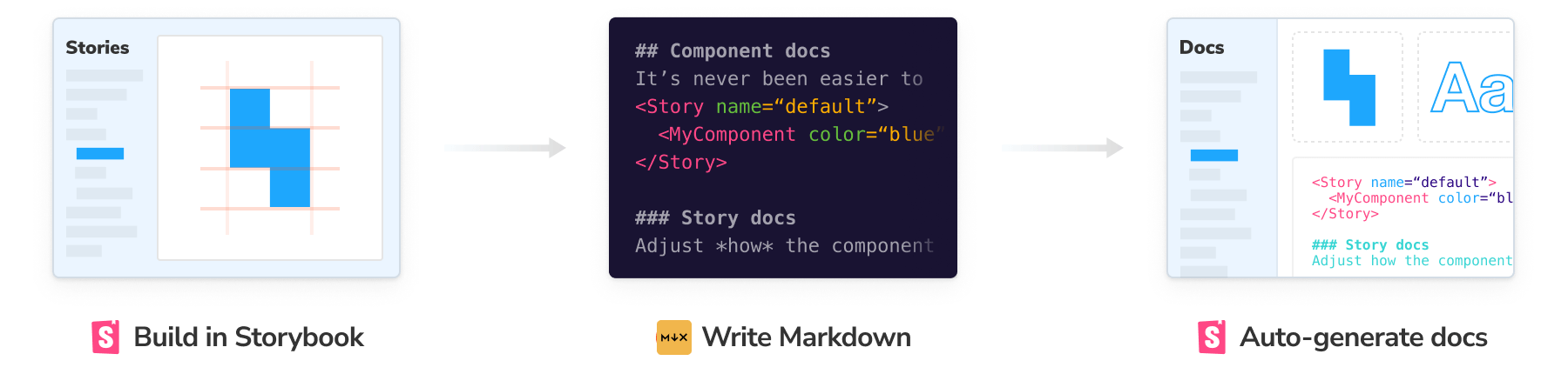
MDX 檔案混合了 Markdown 和 Javascript/JSX,以建立豐富的互動式文件。您可以使用 Markdown 的可讀語法(例如 # heading)來撰寫文件,包含在 元件 Story 格式 (CSF) 中定義的 stories,並在檔案中的任何位置自由嵌入 JSX 元件區塊。一次完成所有操作。
此外,您可以使用 MDX 撰寫純文件頁面,並將其與 stories 一起新增到 Storybook 中。
基本範例
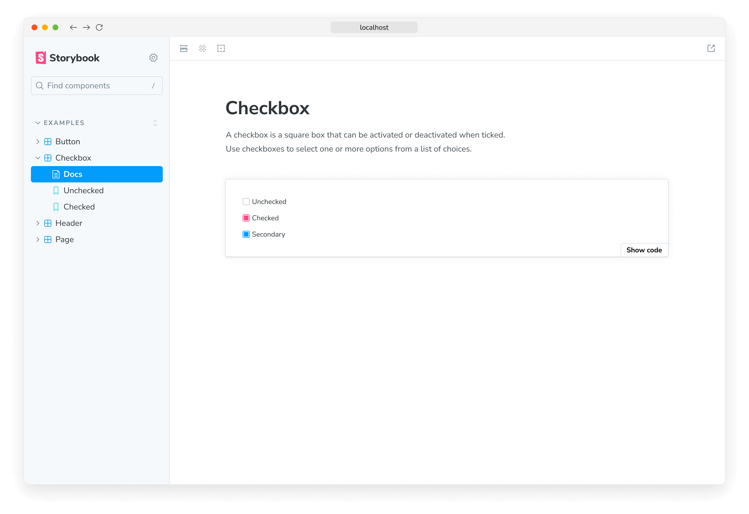
讓我們從一個範例開始,Checkbox.mdx,將 Markdown 與單一 story 結合。
import { Canvas, Meta } from '@storybook/blocks';

import * as CheckboxStories from './Checkbox.stories';

<Meta of={CheckboxStories} />

# Checkbox

A checkbox is a square box that can be activated or deactivated when ticked.

Use checkboxes to select one or more options from a list of choices.

<Canvas of={CheckboxStories.Unchecked} />
此 MDX 檔案參考了一個 story 檔案,Checkbox.stories.js|ts,該檔案是以 元件 Story 格式 (CSF) 撰寫。
// Replace your-framework with the name of your framework
import type { Meta, StoryObj } from '@storybook/your-framework';

import { Checkbox } from './Checkbox';

const meta: Meta<typeof Checkbox> = {
  component: Checkbox,
};

export default meta;
type Story = StoryObj<typeof Checkbox>;

export const Unchecked: Story = {
  args: {
    label: 'Unchecked',
  },
};
以下是它在 Storybook 中的呈現方式
這裡有很多內容。我們正在撰寫 Markdown、JSX,並且我們還在定義和參考 Storybook stories,這些 stories 與整個 Storybook 生態系統是向下相容的。
讓我們分解一下。
MDX 和 CSF
您首先會注意到的是,元件文件分為不同的格式:一種用於撰寫元件 stories,描述每個可能的元件狀態,另一種用於記錄如何使用它們。這種劃分充分利用了每種格式的最佳品質
- CSF 非常適合簡潔地定義 stories(元件範例)。如果您使用 TypeScript,它還提供型別安全和自動完成功能。
- MDX 非常適合撰寫結構化文件,並將其與互動式 JSX 元素組合起來。
MDX 的結構
假設您已經熟悉使用 CSF 撰寫 stories,我們可以更詳細地剖析 MDX 的部分。
文件由空白行分隔的多個區塊組成。由於 MDX 將幾種不同的語言混合在一起,因此它使用這些空白行來幫助區分一個區塊的開始和下一個區塊的開始。未能用空白字元分隔區塊可能會導致(有時是隱晦的)解析錯誤。
依序瀏覽程式碼區塊
{ /* Checkbox.mdx */ }MDX 中的註解是包含 JS 註解的 JSX 區塊。
import { Canvas, Meta } from '@storybook/blocks';

import * as CheckboxStories from './Checkbox.stories';
導入將在檔案其餘部分的 JSX 中使用的元件和 stories。
import { Meta } from '@storybook/blocks';

import * as CheckboxStories from './Checkbox.stories';

<Meta of={CheckboxStories} />當為 Meta 區塊提供 of prop 時,請確保您參考的是 story 檔案的 預設匯出,而不是元件本身,以防止產生的文件出現渲染問題。
Meta 區塊定義了文件在側邊欄中的位置。在此範例中,它與 Checkbox 的 stories 相鄰。預設情況下,文件側邊欄節點的標題為 "文件",但可以透過傳遞 name prop 來自訂(例如,<Meta of={CheckboxStories} name="Info" />)。如果您想將文件節點放置在導航階層結構中的任意位置,可以使用 title prop(例如,<Meta title="path/to/node" />)。
# Checkbox

A checkbox is a square box that can be activated or deactivated when ticked.

Use checkboxes to select one or more options from a list of choices.
MDX 預設支援標準 markdown ("commonmark"),並且可以擴充以支援 GitHub Flavored Markdown (GFM) 和其他擴充功能(請參閱疑難排解章節,以了解有關目前某些限制的更多資訊)。
import { Canvas } from '@storybook/blocks';

import * as CheckboxStories from './Checkbox.stories';

<Canvas of={CheckboxStories.Unchecked} />
最後,MDX 支援任意 JSX 區塊。
在此範例中,我們正在利用「文件區塊」,這是一個文件元件庫,旨在與 Storybook stories 一起使用,以在您的文件中顯示您的 stories、您的元件 API 和用於與您的元件互動的控制項,以及其他實用工具。
除了文件區塊之外,MDX 還可以整合任意 React 元件,使其成為一個非常靈活的文件系統。假設您想要為您的元件提供樣式化的「應做事項和不應做事項」清單;您可以使用現成的元件或自行撰寫元件。
<Guidelines>
  <Dos>
    - Use buttons for the main actions on your page
    - Identify the primary action and make it `primary`
  </Dos>
  <Donts>
    - Use a button when a link will do (e.g., for navigation-only actions)
    - Use multiple `primary` buttons in a single UI state
  </Donts>
</Guidelines>
已知限制
雖然 MDX 支援各種執行階段(React、Preact、Vue),但 Storybook 的實作僅限於 React。這表示您的文件是在 React 中渲染的,而您的 stories 則是在您選擇的執行階段中渲染(React、Vue、Angular、Web Components、Svelte 等)。
設定自訂文件
除了使用 MDX 記錄您的元件之外,您還可以擴充它以撰寫其他類型的內容,例如關於如何使用它們的指南或最佳實務。若要為您的 stories 啟用此格式的自訂文件,請先更新您的 Storybook 設定檔(即 .storybook/main.js|ts|cjs)。
// Replace your-framework with the framework you are using (e.g., react-webpack5, vue3-vite)
import type { StorybookConfig } from '@storybook/your-framework';

const config: StorybookConfig = {
  // Replace your-framework with the framework you are using (e.g., react-webpack5, vue3-vite)
  framework: '@storybook/your-framework',
  stories: [
    //👇 Your documentation written in MDX along with your stories goes here
    '../src/**/*.mdx',
    '../src/**/*.stories.@(js|jsx|mjs|ts|tsx)',
  ],
  addons: ['@storybook/addon-essentials'],
};

export default config;
建立 MDX 檔案以新增您的自訂文件。根據您希望文件在 UI 中的呈現方式,您需要考慮以下使用案例。
使用 Meta 文件區塊
如果您需要將元件文件與現有的 story 匹配,您可以設定 Meta 文件區塊,以控制文件的渲染方式。它開箱即用,可讓您定義自訂標題或參考您需要記錄的 story(即透過 of prop)。例如
import { Meta, Controls } from '@storybook/blocks';

<Meta title="Button" />

# Definition

Button is a clickable interactive element that triggers a response.

You can place text and icons inside of a button.

Buttons are often used for form submissions and to toggle elements into view.

## Usage

The component comes in different variants such as `primary`, `secondary`, `large` and `small` which you can use to alter the look and feel of the button.

## Inputs

Button has the following properties:

<Controls />
撰寫未附加的文件
假設您正在記錄現有的元件,並且僅提供 Meta 文件區塊,而沒有其他 props 或其他區塊。在這種情況下,Storybook 會將其視為「未附加」的文件,或者換句話說,是「僅限文件」的頁面,並且它會在側邊欄導航選單中以不同的方式渲染它
import { Meta } from '@storybook/blocks';

import * as ExampleComponentStories from './ExampleComponent.stories';

{/* 👇 Documentation-only page */}

<Meta title="Documentation" />

{/* 👇 Component documentation page */}

<Meta of={ExampleComponentStories} />
使用檔案系統
但是,對於某些使用案例,例如獨立頁面,甚至是測試元件的指南,可能不需要提供 Meta 文件區塊。在這種情況下,您可以安全地省略它。Storybook 將改為依賴檔案的實體位置,將文件放置在側邊欄中,並以您自己的文件覆寫任何預先存在的 自動產生的文件。例如
# Select

Select is a type of input that allows users to choose one or more options from a list of choices.

The options are hidden by default and revealed when a user interacts with an element.

It shows the currently selected option in its default collapsed state.

## Design implementation

To help users get acquainted with the existing UI elements, it is recommended to use check the Figma file to see how the select input is implemented.

### When to use?

In a select input where there are less than 3-4 items, consider using radio boxes, or radio inputs instead.

### How to use?

To help users understand the options available in a select input, include a default option that is unselectable and acts as a label.如果您要覆寫透過 tags 設定屬性啟用的現有自動產生文件頁面,我們建議移除它以避免錯誤。
載入自訂 MDX 文件後,Storybook 將使用相同的啟發式規則來推斷標題和位置,以產生自動標題 stories,並在側邊欄中以 文件條目渲染它。
使用獨立文件頁面
撰寫獨立文件頁面是一種常見的使用案例,不僅適用於每個元件,也適用於每個專案。例如,您可能想要記錄專案的入門流程,其中包含有關如何使用它的說明。若要執行此操作,您可以建立一個新的 MDX 檔案,其中包含使用類似結構和內容的文件
# Getting Started

Welcome! Whether you're a designer or a developer, this guide will help you get started and connect you to the essential resources you need.

## Table of Contents

- [Design Resources](#design-resources)

  - [Figma](#figma)
  - [UI/UX Design Guidelines](#uiux-design-guidelines)
  - [Design Assets](#design-assets)

- [Development Resources](#development-resources)
  - [Coding Standards](#coding-standards)
  - [Version Control](#version-control)
  - [Development Tools](#development-tools)

---

## Design Resources

### Figma

[Figma](https://www.figma.com/) is a collaborative design and prototyping tool. It's the heart of the design process, allowing designers to work together seamlessly.

- **Get Access**: If you're not already part of the Figma project, request access from the project lead or manager.

### UI/UX Design Guidelines

Before you dive into designing, familiarize yourself with our UI/UX design guidelines. They provide valuable insights into our design philosophy and standards.

- [UI/UX Guidelines Document](https://your-design-guidelines-link.com)

### Design Assets

All the essential design assets like logos, icons, and brand guidelines can be found in the Figma project. Ensure you have access and familiarize yourself with these assets for consistency.

---

## Development Resources

### Coding Standards

Maintaining a consistent code style is essential for collaborative development. Our coding standards document will guide you on best practices.

- [Coding Standards Document](https://your-coding-standards-link.com)

### Version Control

We use Git for version control. Make sure you have Git installed and are familiar with its basics.

### Development Tools

Your development environment is critical. Here are some tools and resources to help you set up your workspace:

- **Code Editor**: We recommend using [Visual Studio Code](https://vscode.dev.org.tw/) for development. It's highly customizable and supports a wide range of extensions.

- **Package Manager**: [npm](https://www.npmjs.com/) is the package manager we use for JavaScript projects. Install it to manage project dependencies.

---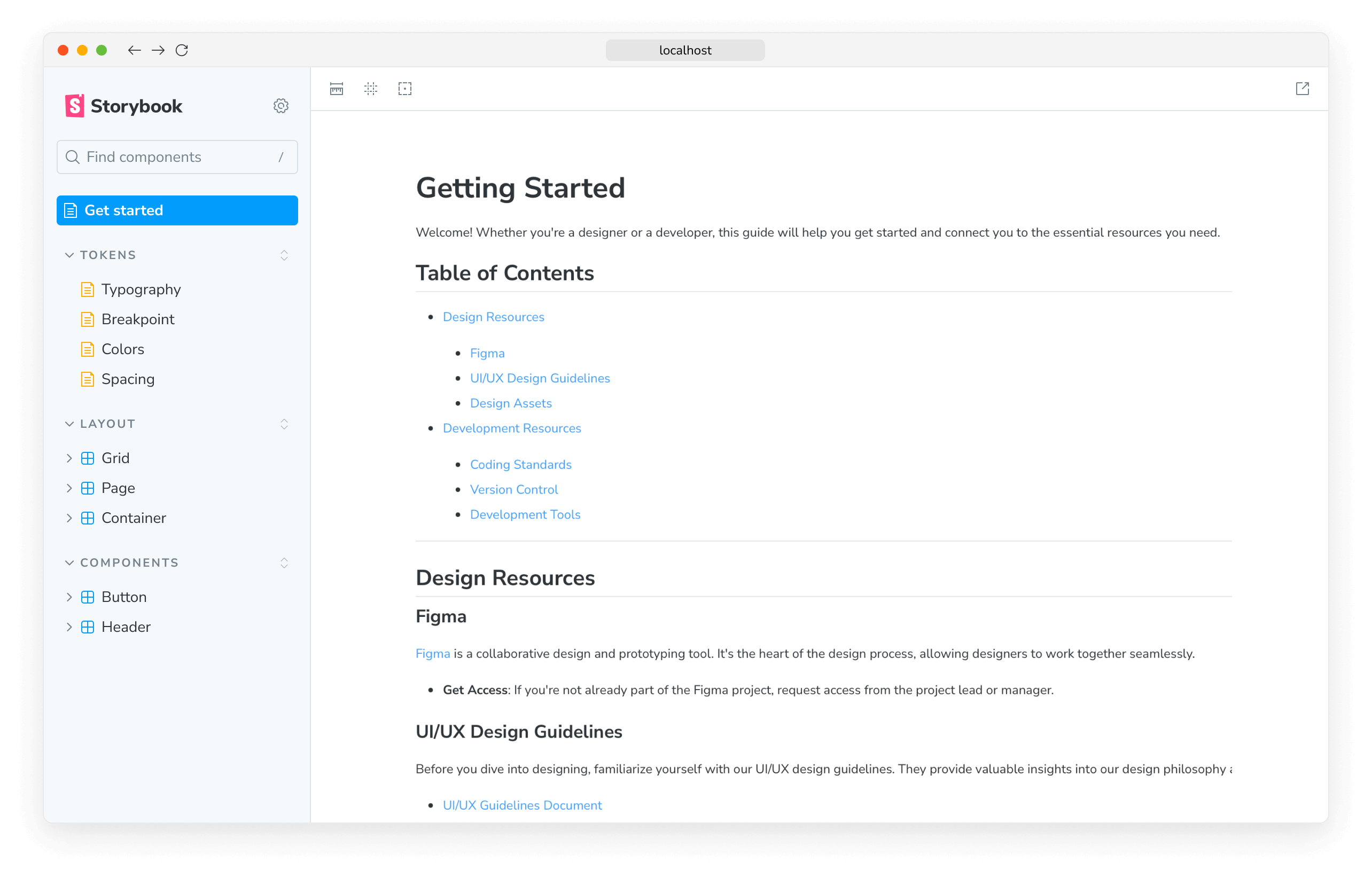
當 Storybook 載入文件時,它將使用檔案的實體位置推斷頁面在側邊欄導航選單中的位置,並將其渲染為 文件條目。
完全控制自訂文件
當應用於每個專案元件時,文件可能會很難維護和保持最新。為了簡化此流程,Storybook 提供了一組有用的 UI 元件(即文件區塊),以幫助涵蓋更進階的案例。如果您需要其他內容,請使用它們來協助建立您的自訂文件。
import { Meta, Story } from '@storybook/blocks';

import * as ButtonStories from './Button.stories';

<Meta of={ButtonStories} />

# Button

Button is a clickable interactive element that triggers a response.

You can place text and icons inside of a button.

Buttons are often used for form submissions and to toggle elements into view.

## Usage

<Story of={ButtonStories.Basic} />
使用多個元件
如果您需要在單個文件頁面中記錄多個元件,您可以直接在 MDX 檔案中參考它們。在內部,Storybook 會尋找 story 元數據,並將其與您現有的文件一起組合起來。例如
import { Canvas, Meta, Story } from '@storybook/blocks';

import * as ListStories from './List.stories';

import * as ListItemStories from './ListItem.stories';

import * as PageStories from './Page.stories';

<Meta of={PageStories} />

# Page

Page is a layout container that is used to position children in predetermined areas.

It's often used to apply consistent positioning for content across pages in an application

## Usage

<Canvas of={PageStories.Basic} />

# List

List is a grouping of related items. List can be ordered with multiple levels of nesting.

## Usage

<Story of={ListStories.Filled} />

# List Item

List items are used to group related content in a list. They must be nested within a List component.

## Usage

<Story of={ListItemStories.Starter} meta={ListItemStories} />
從 Markdown 產生文件
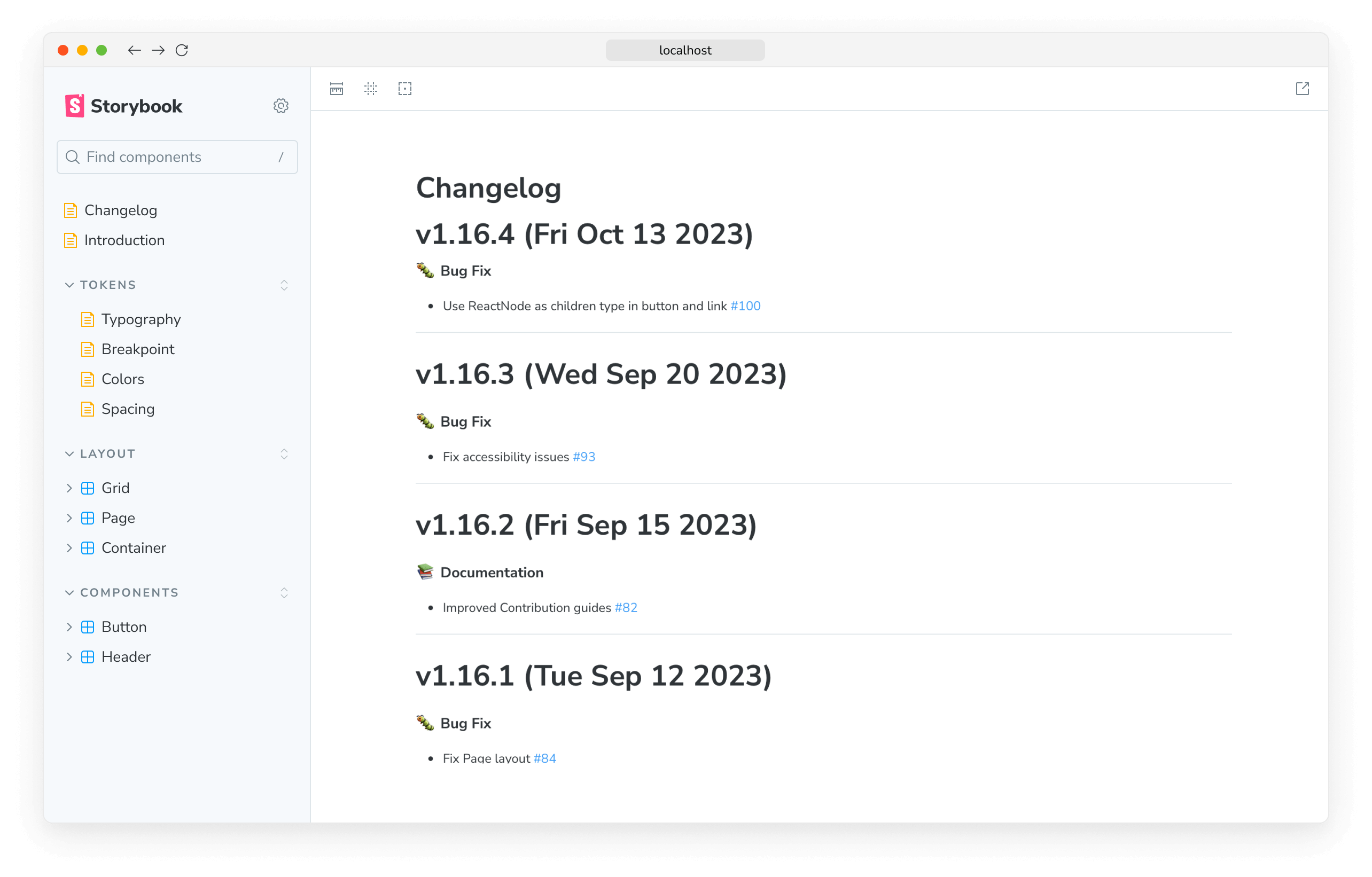
如果您需要使用 Markdown 撰寫的其他內容來擴充您的文件,您可以使用 Markdown 文件區塊來導入可用的內容,Storybook 將會將其與您現有的文件一起渲染。例如,如果您有一個 CHANGELOG.md 檔案,您可以導入它並在您的文件頁面中渲染它,如下所示
import { Meta, Markdown } from '@storybook/blocks';

import Readme from '../../Changelog.md?raw';

<Meta title="Changelog" />

# Changelog

<Markdown>{Readme}</Markdown>Markdown 文件區塊提供了其他設定選項,以自訂文件的渲染方式。如需更多資訊,請參閱API 文件。
連結到其他 stories 和頁面
改進文件的另一種方法是連結到其他 stories 和頁面。假設您已經有一個元件 story,其唯一識別碼為 some--id,並且您想要將其連結到您的文件頁面。在這種情況下,您可以使用 path 查詢字串重新導向至與 story 相關的文件條目
[Go to specific documentation page](?path=/docs/some--id)相反地,如果您需要定位特定的文件章節,您可以調整連結以指向它。例如
[Go to the conclusion of the documentation page](?path=/docs/some--id#conclusion)但是,文件之間的交叉連結不限於文件頁面。如果您需要參考特定的 story,您可以調整 path 查詢並提供 story 的唯一識別碼。例如
[Go to specific story canvas](?path=/story/some--id)透過將此模式與 Controls 附加元件一起應用,所有錨點都將在 Canvas 中被忽略,這是基於 Storybook 如何處理 URL 以追蹤 args 值。
疑難排解
Markdown 表格未正確渲染
如果您正在擴充您的文件以包含特定功能(例如表格、註腳),您可能會遇到一些問題,無法使用 Storybook 支援的目前 MDX 版本正確渲染它們。我們建議在您的設定檔(即 .storybook/main.js|ts)中啟用 remark-gfm 外掛程式,以正確渲染它們。
import remarkGfm from 'remark-gfm';

// Replace your-framework with the framework you are using (e.g., react-webpack5, vue3-vite)
import type { StorybookConfig } from '@storybook/your-framework';

const config: StorybookConfig = {
  framework: '@storybook/your-framework',
  stories: ['../src/**/*.mdx', '../src/**/*.stories.@(js|jsx|mjs|ts|tsx)'],
  addons: [
    // Other addons go here
    {
      name: '@storybook/addon-docs',
      options: {
        mdxPluginOptions: {
          mdxCompileOptions: {
            remarkPlugins: [remarkGfm],
          },
        },
      },
    },
  ],
};

export default config;remark-gfm 套件預設未包含在 Storybook 中,必須作為開發依賴項單獨安裝。若要深入瞭解如何使用它以及 MDX 引入的其他重大變更,請參閱 GFM 指南 和 MDX 團隊提供的 遷移指南,以取得更多資訊。
MDX 文件在我的環境中未渲染
由於 Storybook 依賴 MDX 3 渲染文件,因此某些技術限制可能會阻止您遷移到此版本。如果發生這種情況,我們已準備好一組說明,以協助您轉換到這個新版本。
Storybook 未為我的元件 stories 建立文件
如果您遇到 Storybook 無法偵測和渲染元件 stories 文件的情況,這可能是由於您的 Storybook 中設定錯誤所致。檢查您的設定檔(即 .storybook/main.js|ts),並確保 stories 設定元素提供了 stories 位置的正確路徑(例如,../src/**/*.stories.@(js|jsx|mjs|ts|tsx))。
遷移似乎不穩定且持續失敗
預設情況下,執行遷移命令會提示您根據 Storybook 支援的 MDX 版本更新專案中現有的 MDX 檔案。但是,這可能是一個破壞性流程,特別是如果您是從先前版本的 Storybook 升級,而您在其中使用了舊版 MDX 格式。為了幫助您排解這些問題,我們準備了一些可能有助於您的建議。
首先,在您的專案目錄中執行以下命令
npx @hipster/mdx2-issue-checker根據數量,您可能需要多次執行命令才能修復所有問題。
完成後,它將輸出導致問題的檔案清單。然後,您可以使用此資訊手動修復問題。
此外,如果您正在使用 VSCode,您可以新增 MDX 擴充功能,並透過將以下內容新增至您的使用者設定來啟用 MDX 實驗性支援,以進行 linting、型別檢查和自動完成
{
  "mdx.experimentalLanguageServer": true
}如果您仍然遇到問題,我們建議使用預設的溝通管道(例如GitHub 討論區)與社群聯繫。
控制項未更新 MDX 文件頁面中的 story
如果您透過 inline 設定選項關閉了 stories 的內嵌渲染,您將遇到關聯的控制項未更新文件頁面中 story 的情況。這是目前實作的已知限制,將在未來的版本中解決。
使用的 React 版本出乎意料
對於大多數專案,Storybook 的 addon-docs 使用專案依賴項中列出的 React 版本。如果找不到,它將使用 React 18.2.0。以下是兩個例外情況
- Preact 專案將始終使用 React 17
- Next.js 專案將始終使用 Next.js 版本隨附的 Canary 版本,無論專案的依賴項中列出了哪個 React 版本。
如果您在使用 React 版本時遇到問題,您可能需要重新建立專案的 node_modules 資料夾,以確保使用正確的版本。
深入了解 Storybook 文件