
自動化文件和 Storybook
觀看影片教學
Storybook Autodocs 是一個強大的工具,可以幫助您快速為 UI 組件生成全面的文件。透過利用 Autodocs,您正在將您的 stories 轉變為即時文件,這些文件可以進一步使用 MDX 和 Doc Blocks 擴展,以提供對組件功能的清晰簡潔的理解。
Storybook 推斷相關的元數據(例如,args、argTypes、parameters),並自動生成一個文件頁面,其中包含此資訊,並位於側邊欄中組件樹狀結構的根層級。
設定自動化文件
Autodocs 是透過 tags 進行設定。如果 CSF 檔案包含至少一個標記為 autodocs 的 story,則會為該組件生成一個文件頁面。
若要為專案中的所有 stories 啟用自動文件,請將其新增至 .storybook/preview.js|ts 檔案中的 tags
// Replace your-renderer with the renderer you are using (e.g., react, vue3)
import type { Preview } from '@storybook/your-renderer';

const preview: Preview = {
  // ...rest of preview
  //👇 Enables auto-generated documentation for all stories
  tags: ['autodocs'],
};

export default preview;
您也可以在組件(或 story)層級啟用它
// Replace your-framework with the framework you are using (e.g., nextjs, vue3-vite)
import type { Meta } from '@storybook/your-framework';

import { Button } from './Button';

const meta: Meta<typeof Button> = {
  component: Button,
  //👇 Enables auto-generated documentation for this component and includes all stories in this file
  tags: ['autodocs'],
};
export default meta;您可以透過移除標籤來停用特定組件的自動文件
// Replace your-framework with the framework you are using (e.g., nextjs, vue3-vite)
import type { Meta } from '@storybook/your-framework';

import { Page } from './Page';

const meta: Meta<typeof Page> = {
  component: Page,
  // 👇 Disable auto-generated documentation for this component
  tags: ['!autodocs'],
};
export default meta;
同樣地,您可以透過移除標籤,從自動文件頁面中排除特定的 story
// Replace your-framework with the framework you are using (e.g., nextjs, vue3-vite)
import type { Meta, StoryObj } from '@storybook/your-framework';

import { Button } from './Button';

const meta: Meta<typeof Button> = {
  component: Button,
  //👇 Enables auto-generated documentation for this component and includes all stories in this file
  tags: ['autodocs'],
};
export default meta;

type Story = StoryObj<typeof Button>;

export const UndocumentedStory: Story = {
  // 👇 Removes this story from auto-generated documentation
  tags: ['!autodocs'],
};
設定
除了使用 tags 啟用功能外,您還可以擴展 Storybook 設定檔(即 .storybook/main.js|ts|cjs),並提供其他選項來控制文件的建立方式。以下列出可用的選項以及如何使用它們的範例。
// Replace your-framework with the framework you are using (e.g., react-webpack5, vue3-vite)
import type { StorybookConfig } from '@storybook/your-framework';

const config: StorybookConfig = {
  framework: '@storybook/your-framework',
  stories: ['../src/**/*.mdx', '../src/**/*.stories.@(js|jsx|mjs|ts|tsx)'],
  addons: ['@storybook/addon-essentials'],
  docs: {
    //👇 See the table below for the list of supported options
    defaultName: 'Documentation',
  },
};

export default config;| 選項 | 描述 |
|---|---|
defaultName | 重新命名自動生成的文件頁面 預設值: docs: { defaultName: 'Documentation' } |
編寫自訂範本
觀看影片教學
若要替換 Storybook 使用的預設文件範本,您可以擴展 UI 設定檔(即 .storybook/preview.js|ts)並引入 docs 參數。此參數接受一個 page 函數,該函數會傳回一個 React 組件,您可以使用它來生成所需的範本。例如
// Replace your-framework with the framework you are using (e.g., react, vue3)
import { Preview } from '@storybook/your-framework';

import { Title, Subtitle, Description, Primary, Controls, Stories } from '@storybook/blocks';

const preview: Preview = {
  parameters: {
    controls: {
      matchers: {
        color: /(background|color)$/i,
        date: /Date$/,
      },
    },
    docs: {
      page: () => (
        <>
          <Title />
          <Subtitle />
          <Description />
          <Primary />
          <Controls />
          <Stories />
        </>
      ),
    },
  },
};

export default preview;在內部,Storybook 使用類似的實作來生成預設範本。請參閱 Doc Blocks API 參考,以深入瞭解 Doc Blocks 的運作方式。
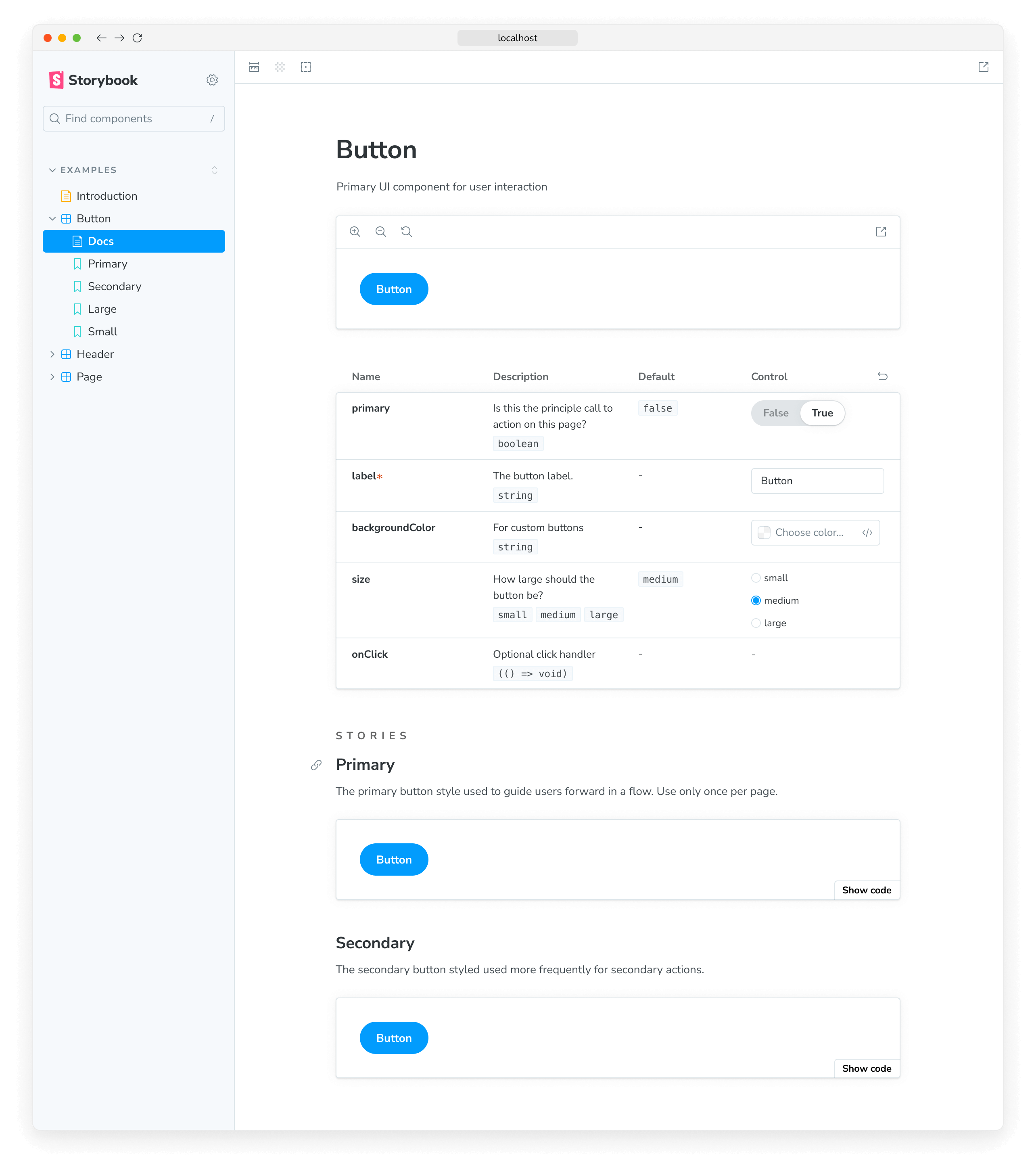
更詳細地檢視程式碼片段。當 Storybook 啟動時,它將使用由以下組成的自訂範本覆寫預設範本
- 一個標頭,其中包含由
Title、Subtitle和DescriptionDoc Blocks 檢索的組件元數據。 - 檔案中透過
PrimaryDoc Block 定義的第一個 story,並提供一組方便的 UI 控制項,可放大和縮小組件。 - 一個互動式表格,其中包含透過
ControlsDoc Block 在 story 中定義的所有相關args和argTypes。 - 透過
StoriesDoc Block 概述剩餘的 stories。
使用 MDX
您也可以使用 MDX 來生成文件範本。這在未設定 JSX 處理的非 React 專案中非常有用。通常,當您在專案中建立 MDX 檔案時,它會被視為一般文件。若要指示 MDX 檔案是文件範本,請將 isTemplate 屬性提供給其 Meta Doc Block。例如
import { Meta, Title, Primary, Controls, Stories } from '@storybook/blocks';

{/*
  * 👇 The isTemplate property is required to tell Storybook that this is a template
  * See https://storybook.dev.org.tw/docs/api/doc-blocks/doc-block-meta
  * to learn how to use
*/}

<Meta isTemplate />

<Title />

# Default implementation

<Primary />

## Inputs

The component accepts the following inputs (props):

<Controls />

---

## Additional variations

Listed below are additional variations of the component.

<Stories />
然後,您可以透過匯入在 .storybook/preview.js|ts 或個別 story 檔案中使用它
import DocumentationTemplate from './DocumentationTemplate.mdx';

export default {
  parameters: {
    docs: {
      page: DocumentationTemplate,
    },
  },
};如果您只需要覆寫單一組件的文件頁面,我們建議建立 MDX 檔案,並透過 <Meta of={} /> Doc Block 直接參考它。
生成目錄
Storybook 自動生成的文件頁面可能很長且難以導航。為了幫助解決此問題,您可以啟用目錄功能,以快速概述文件頁面,並允許使用者跳至特定章節。若要啟用它,請擴展 Storybook UI 設定檔(即 .storybook/preview.js|ts),並提供具有 toc 屬性的 docs 參數。
// Replace your-framework with the framework you are using (e.g., react, vue3)
import { Preview } from '@storybook/your-framework';

const preview: Preview = {
  parameters: {
    docs: {
      toc: true, // 👈 Enables the table of contents
    },
  },
};

export default preview;
設定目錄
預設情況下,文件頁面上的目錄只會顯示自動生成的 h3 標題。但是,如果您想要自訂目錄,您可以將更多參數新增至 toc 屬性。以下是可用的選項以及如何使用它們的範例。
| 選項 | 描述 |
|---|---|
contentsSelector | 定義容器的 CSS 選擇器,以搜尋標題toc: { contentsSelector: '.sbdocs-content' } |
disable | 隱藏文件頁面的目錄toc: { disable: true } |
headingSelector | 定義要在目錄中顯示的標題清單toc: { headingSelector: 'h1, h2, h3' } |
ignoreSelector | 設定目錄以忽略特定的標題或 stories。預設情況下,目錄將忽略所有放置在 Story blocks 中的內容toc: { ignoreSelector: '.docs-story h2' } |
title | 定義目錄的標題 接受以下其中一項: string、null、React 元素toc: { title: '目錄' } |
unsafeTocbotOptions | 提供其他 TocBot 設定選項toc: { unsafeTocbotOptions: { orderedList: true } } |
contentsSelector、headingSelector 和 ignoreSelector 屬性允許額外的自訂。如需有關使用它們的更多資訊,請參閱 Tocbot 文件。
// Replace your-framework with the framework you are using (e.g., react, vue3)
import { Preview } from '@storybook/your-framework';

const preview: Preview = {
  parameters: {
    docs: {
      toc: {
        contentsSelector: '.sbdocs-content',
        headingSelector: 'h1, h2, h3',
        ignoreSelector: '#primary',
        title: 'Table of Contents',
        disable: false,
        unsafeTocbotOptions: {
          orderedList: false,
        },
      },
    },
  },
};

export default preview;
組件層級設定
如果您想要自訂特定 story 的目錄,您可以在 story 的預設匯出中包含 toc 屬性,並提供所需的設定。例如,如果您需要隱藏特定 story 的目錄,請如下調整您的 story
// Replace your-framework with the name of your framework
import type { Meta } from '@storybook/your-framework';

import { MyComponent } from './MyComponent';

const meta: Meta<typeof MyComponent> = {
  component: MyComponent,
  tags: ['autodocs'],
  parameters: {
    docs: {
      toc: {
        disable: true, // 👈 Disables the table of contents
      },
    },
  },
};

export default meta;
自訂組件文件
使用 Storybook 的 Autodocs 建立自動化文件為您提供了建構永續文件模式的起點。儘管如此,它可能不適用於所有情況,您可能想要擴展它並提供額外資訊。我們建議結合 MDX 與 Storybook 的 Doc Blocks 以用於此類情況,來撰寫您的文件。
進階設定
記錄多個組件
有時一起記錄多個組件很有幫助。例如,組件庫的 ButtonGroup 和 Button 組件可能彼此不可或缺。
Autodocs 允許您記錄您的「主要」組件(由 component 屬性定義)以及與其相關的一個或多個 subcomponents。
import React from 'react';
import type { Meta, StoryObj } from '@storybook/react';

import { List } from './List';
import { ListItem } from './ListItem';

const meta: Meta<typeof List> = {
  component: List,
  subcomponents: { ListItem }, //👈 Adds the ListItem component as a subcomponent
};
export default meta;

type Story = StoryObj<typeof List>;

export const Empty: Story = {};

export const OneItem: Story = {
  render: (args) => (
    <List {...args}>
      <ListItem />
    </List>
  ),
};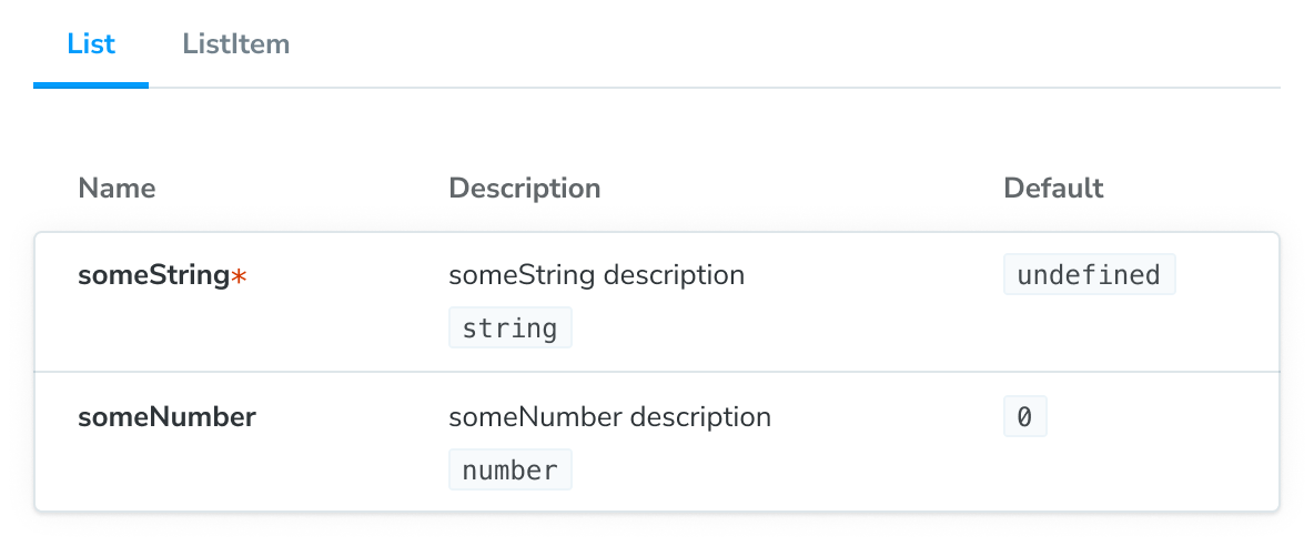
主要組件及其子組件將顯示在 ArgTypes doc block 的分頁版本中。分頁標題將對應於 subcomponents 物件的鍵。
如果您想要以不同的方式組織組件群組的文件,我們建議使用 MDX。它可以讓您完全控制組件的顯示方式,並支援任何設定。
自訂文件容器
文件容器是封裝文件頁面的組件。它負責在 Storybook 的 UI 中渲染文件頁面。您可以透過建立自己的組件並更新 Storybook UI 設定檔(即 .storybook/preview.js|ts)以參考它來自訂它。
import * as React from 'react';

// Replace your-framework with the framework you are using (e.g., react, vue3)
import { Preview } from '@storybook/your-framework';

import { DocsContainer } from '@storybook/blocks';

const ExampleContainer = ({ children, ...props }) => {
  return <DocsContainer {...props}>{children}</DocsContainer>;
};

const preview: Preview = {
  parameters: {
    controls: {
      matchers: {
        color: /(background|color)$/i,
        date: /Date$/,
      },
    },
    docs: {
      container: ExampleContainer,
    },
  },
};

export default preview;
覆寫預設主題
預設情況下,Storybook 為 UI 提供兩個主題:light 和 dark。如果您需要自訂文件使用的主題以符合現有主題,您可以更新 Storybook UI 設定檔(即 .storybook/preview.js|ts)並套用它。
// Replace your-framework with the framework you are using (e.g., react, vue3)
import { Preview } from '@storybook/your-framework';

import { themes, ensure } from '@storybook/theming';

const preview: Preview = {
  parameters: {
    controls: {
      matchers: {
        color: /(background|color)$/i,
        date: /Date$/,
      },
    },
    docs: {
      theme: ensure(themes.dark), // The replacement theme to use
    },
  },
};

export default preview;
使用自訂 MDX 組件
開箱即用,Storybook 擁有一組組件,您可以使用這些組件來自訂文件頁面。如果您正在使用設計系統或組件庫,並希望將它們新增至文件頁面,您可以覆寫從 @mdx-js/react 繼承的 MDXProvider 組件與您自己的組件。但是,這裡有一個注意事項,組件替換只會在您使用 Markdown 語法(例如,# 用於標題)編寫文件時才會產生影響。原生 HTML 元素,例如 <h1>,將不會被您的自訂實作取代。
// Replace your-framework with the framework you are using (e.g., react, vue3)
import { Preview } from '@storybook/your-framework';

import { MDXProvider } from '@mdx-js/react';

import { DocsContainer } from '@storybook/blocks';

import * as DesignSystem from 'your-design-system';

export const MyDocsContainer = (props) => (
  <MDXProvider
    components={{
      h1: DesignSystem.H1,
      h2: DesignSystem.H2,
    }}
  >
    <DocsContainer {...props} />
  </MDXProvider>
);

const preview: Preview = {
  parameters: {
    controls: {
      matchers: {
        color: /(background|color)$/i,
        date: /Date$/,
      },
    },
    docs: {
      container: MyDocsContainer,
    },
  },
};

export default preview;這不是 Storybook 的問題,而是 MDX 運作方式的細節。摘錄自他們的 遷移指南
「由於缺乏更好的名稱,我們現在對組件進行「沙箱化」。這表示當您傳遞 h1 的組件時,它確實會用於 # hi,但不會用於 <h1>hi</h1>」
疑難排解
目錄未如預期般渲染
當使用 Autodocs 的目錄時,您可能會遇到目錄顯示與預期不同的情況。為了幫助您解決這些問題,我們整理了一份可能導致問題的可能情境清單。
使用簡單的文件頁面
如果您有一個只有一個相符標題的文件頁面,並為其建立目錄,則預設情況下目錄不會隱藏。此問題的潛在解決方案是新增第二個標題或完全關閉它。
使用小螢幕
如果螢幕寬度小於 1200 像素,則預設情況下目錄將會隱藏。目前,此問題沒有內建的解決方案,並且不會影響文件頁面的樣式相容性。
使用 MDX
如果您使用 MDX 撰寫未附加的文件,由於目前的實作缺乏對基於目前實作定義參數的支援,因此您無法自訂目錄。因此,目錄將始終恢復為全域提供的預設設定。
自動生成的文件未在 monorepo 設定中顯示
開箱即用,Storybook 的 Autodocs 功能旨在自動為您的 stories 生成文件。儘管如此,如果您正在使用 monorepo 設定(例如,Yarn Workspaces、pnpm Workspaces),您可能會遇到部分文件可能未為您生成的問題。為了幫助您排除這些問題,我們準備了一些可能有助於您的建議。
更新您的匯入語句以直接參考組件,而不是套件的根目錄。例如
// Replace your-framework with the name of your framework
import type { Meta } from '@storybook/your-framework';

// ❌ Don't use the package's index file to import the component.
// import { MyComponent } from '@component-package';

// ✅ Use the component's export to import it directly.
import { MyComponent } from '@component-package/src/MyComponent';

const meta: Meta<typeof MyComponent> = {
  /* 👇 The title prop is optional.
   * See https://storybook.dev.org.tw/docs/configure/#configure-story-loading
   * to learn how to generate automatic titles
   */
  title: 'MyComponent',
  component: MyComponent,
};

export default meta;
此外,如果您正在使用 TypeScript 進行開發,您可能需要更新 Storybook 的設定檔(即 .storybook/main.js|ts)以包含以下內容
// Replace your-framework with the framework you are using (e.g., react-webpack5, vue3-vite)
import type { StorybookConfig } from '@storybook/your-framework';

const config: StorybookConfig = {
  framework: '@storybook/your-framework',
  stories: ['../src/**/*.mdx', '../src/**/*.stories.@(js|jsx|mjs|ts|tsx)'],
  typescript: {
    // Overrides the default Typescript configuration to allow multi-package components to be documented via Autodocs.
    reactDocgen: 'react-docgen',
    check: false,
  },
};

export default config;如果您仍然遇到問題,我們建議使用預設的溝通管道(例如,GitHub 討論區)聯繫社群。
控制項未更新自動生成的文件中的 story
如果您透過inline 設定選項關閉了 stories 的內嵌渲染,您將遇到關聯的控制項未更新文件頁面中 story 的情況。這是目前實作的已知限制,將在未來版本中解決。
深入瞭解 Storybook 文件
- Autodocs 用於為您的 stories 建立文件
- MDX 用於自訂您的文件
- Doc Blocks 用於撰寫您的文件
- 發佈文件以自動化發佈文件流程