
控制項
觀看影片教學
Storybook 控制項提供圖形使用者介面,讓您無需編寫程式碼即可動態與元件的引數互動。它會在您的元件範例(「stories」)旁邊建立一個附加元件面板,因此您可以即時編輯它們。
控制項不需要對您的元件進行任何修改。控制項的 stories 為
- 方便。根據 React/Vue/Angular 等元件自動產生控制項。
- 可攜式。在文件、測試,甚至在設計中重複使用您的互動式 stories。
- 豐富。自訂控制項和互動式資料,以符合您的精確需求。
若要使用控制項附加元件,您需要使用引數 (args)編寫 stories。Storybook 會根據您的引數以及它可以推斷出的元件,自動產生 UI 控制項。不過,您可以使用argTypes進一步設定控制項,請參閱下文。
如果您有舊的 Storybook 6 之前風格的 stories,請查看引數和控制項遷移指南,以了解如何將您現有的 stories 轉換為引數。
選擇控制項類型
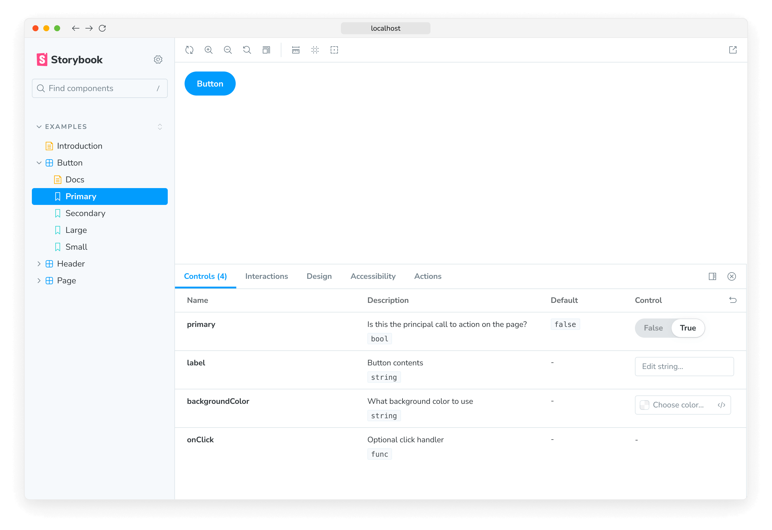
預設情況下,Storybook 會根據每個引數的初始值,為其選擇一個控制項。這對於特定的引數類型(例如 boolean 或 string)效果良好。若要啟用它們,請將 component 註解新增至 story 檔案的預設匯出,它將用於推斷控制項,並使用react-docgen自動產生元件的相符argTypes,react-docgen是 React 元件的文件產生器,其中也包含對 TypeScript 的一流支援。
import type { Meta } from '@storybook/react';

import { Button } from './Button';

const meta: Meta<typeof Button> = {
  component: Button,
};

export default meta;
例如,假設您的 story 上有一個 variant 引數,該引數應該是 primary 或 secondary
// Replace your-framework with the name of your framework
import type { Meta, StoryObj } from '@storybook/your-framework';

import { Button } from './Button';

const meta: Meta<typeof Button> = {
  component: Button,
};

export default meta;
type Story = StoryObj<typeof Button>;

export const Primary: Story = {
  args: {
    variant: 'primary',
  },
};
預設情況下,Storybook 會為 variant 引數呈現自由文字輸入
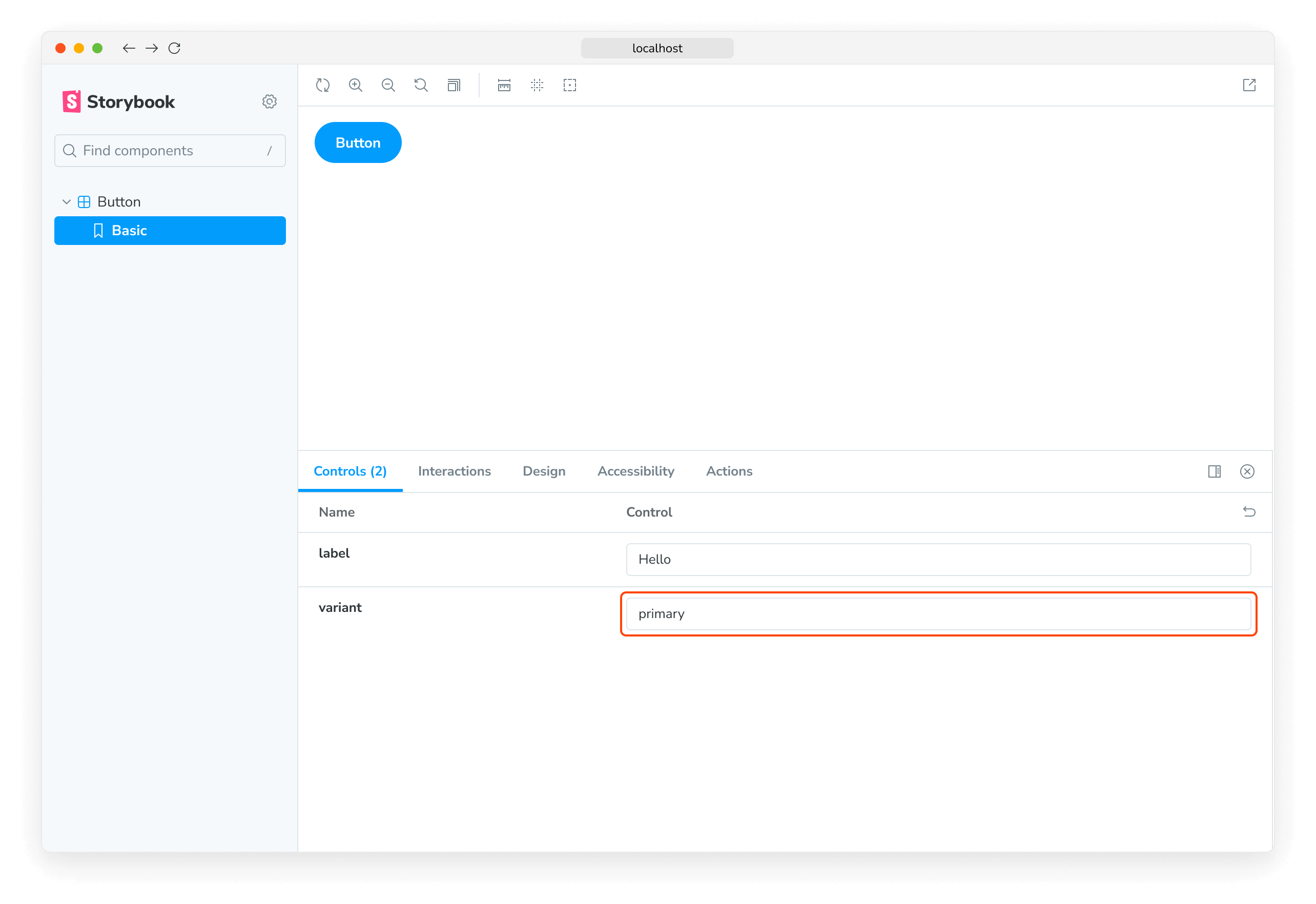
只要您在自動產生的文字控制項中輸入有效的字串,它就可以運作。不過,這並非我們案例中的最佳 UI,因為元件只接受 primary 或 secondary 作為變體。讓我們將其替換為 Storybook 的單選元件。
我們可以透過宣告 variant 屬性的自訂argType來指定使用哪些控制項。ArgTypes 會編碼引數的基本中繼資料,例如引數的名稱、描述和 defaultValue。這些會由 Storybook 文件自動填入。
ArgTypes 也可以包含使用者可以覆寫的任意註解。由於 variant 是元件的屬性,因此讓我們將該註解放在預設匯出上。
// Replace your-framework with the name of your framework
import type { Meta } from '@storybook/your-framework';
import { Button } from './Button';
const meta: Meta<typeof Button> = {
component: Button,
argTypes: {
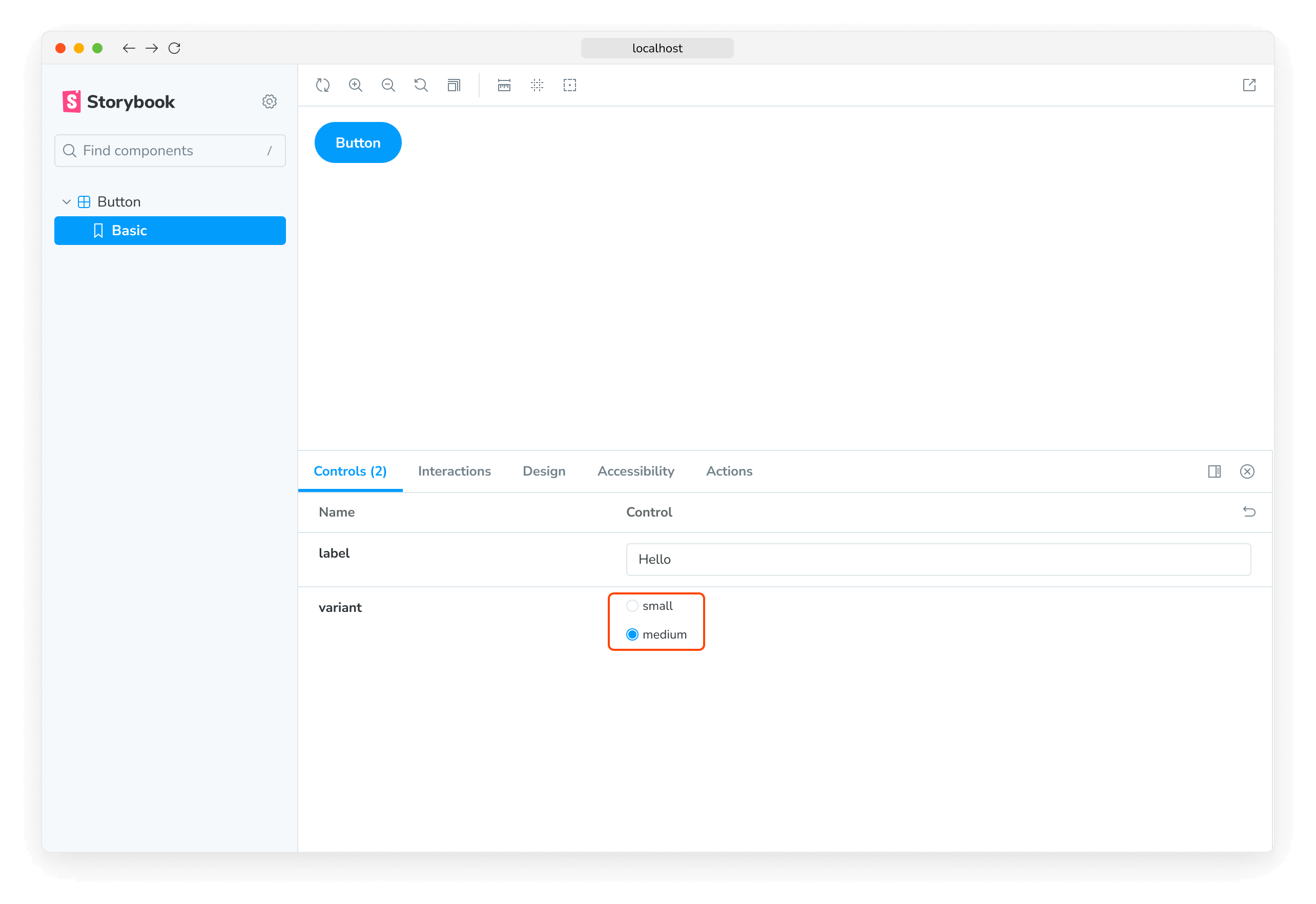
variant: {
options: ['primary', 'secondary'],
control: { type: 'radio' },
},
},
};
export default meta;ArgTypes 是一項強大的功能,可用於自訂 stories 的控制項。如需詳細資訊,請參閱有關使用 argTypes 註解自訂控制項的文件。
這會將輸入替換為單選群組,以獲得更直觀的體驗。
自訂控制項類型比對器
控制項可以使用regex從引數的名稱自動推斷,但目前僅適用於色彩選取器和日期選取器控制項。如果您已使用 Storybook CLI 設定您的專案,它應該已在 .storybook/preview.js 中自動建立下列預設值
| 控制項 | 預設 regex | 描述 |
|---|---|---|
| 色彩 | /(background|color)$/i | 將為符合它的引數顯示色彩選取器 UI |
| 日期 | /Date$/ | 將為符合它的引數顯示日期選取器 UI |
如果您未使用 CLI 設定設定,或者想要定義您的模式,請使用 controls 參數中的 matchers 屬性
// Replace your-framework with the framework you are using (e.g., react, vue3)
import { Preview } from '@storybook/your-framework';

const preview: Preview = {
  parameters: {
    controls: {
      matchers: {
        color: /(background|color)$/i,
        date: /Date$/,
      },
    },
  },
};

export default preview;
完全自訂的參數
到目前為止,我們僅使用根據我們正在撰寫故事的元件自動產生的控制項。如果我們正在撰寫複雜的故事,我們可能會想要為不屬於元件的參數新增控制項。例如,以下說明如何使用 footer 參數來填入子元件
import type { Meta, StoryObj } from '@storybook/react';

import { Page } from './Page';

type PagePropsAndCustomArgs = React.ComponentProps<typeof Page> & { footer?: string };

const meta: Meta<PagePropsAndCustomArgs> = {
  component: Page,
  render: ({ footer, ...args }) => (
    <Page {...args}>
      <footer>{footer}</footer>
    </Page>
  ),
};
export default meta;

type Story = StoryObj<PagePropsAndCustomArgs>;

export const CustomFooter: Story = {
  args: {
    footer: 'Built with Storybook',
  },
};
預設情況下,Storybook 會為以下所有參數新增控制項
-
如果您的框架支援,它會從元件定義推斷出 如果您的框架支援。
-
出現在您的故事參數清單中。
使用 argTypes,您可以變更每個控制項的顯示方式和行為。
處理複雜的值
處理非原始值時,您會注意到您會遇到一些限制。最明顯的問題是並非每個值都可以表示為 URL 中 args 參數的一部分,因而失去共用和深度連結到此狀態的能力。除此之外,管理員(例如,Controls 附加元件)和預覽(您的故事)之間無法同步處理複雜的值,例如 JSX。
其中一種解決方式是使用原始值(例如,字串)作為參數值,並新增自訂 render 函式,在轉譯之前將它們轉換為複雜的對應值。這不是最理想的處理方式(請參閱下方),但絕對是最靈活的。
import type { Meta, StoryObj } from '@storybook/react';

import { YourComponent } from './your-component';

const meta: Meta<typeof YourComponent> = {
  component: YourComponent,
  //👇 Creates specific argTypes with options
  argTypes: {
    propertyA: {
      options: ['Item One', 'Item Two', 'Item Three'],
      control: { type: 'select' }, // Automatically inferred when 'options' is defined
    },
    propertyB: {
      options: ['Another Item One', 'Another Item Two', 'Another Item Three'],
    },
  },
};

export default meta;
type Story = StoryObj<typeof YourComponent>;

const someFunction = (valuePropertyA, valuePropertyB) => {
  // Do some logic here
};

export const ExampleStory: Story = {
  render: (args) => {
    const { propertyA, propertyB } = args;
    //👇 Assigns the function result to a variable
    const someFunctionResult = someFunction(propertyA, propertyB);

    return <YourComponent {...args} someProperty={someFunctionResult} />;
  },
  args: {
    propertyA: 'Item One',
    propertyB: 'Another Item One',
  },
};
除非您需要函式的彈性,否則在轉譯之前將原始值對應至複雜值的一種更簡單方式是定義 mapping;此外,您可以指定 control.labels 來為您的核取方塊、單選按鈕或選取輸入設定自訂標籤。
// Replace your-framework with the name of your framework
import type { Meta } from '@storybook/your-framework';

import { Button } from './Button';

import { ArrowUp, ArrowDown, ArrowLeft, ArrowRight } from './icons';

const arrows = { ArrowUp, ArrowDown, ArrowLeft, ArrowRight };

const meta: Meta<typeof Button> = {
  component: Button,
  argTypes: {
    arrow: {
      options: Object.keys(arrows), // An array of serializable values
      mapping: arrows, // Maps serializable option values to complex arg values
      control: {
        type: 'select', // Type 'select' is automatically inferred when 'options' is defined
        labels: {
          // 'labels' maps option values to string labels
          ArrowUp: 'Up',
          ArrowDown: 'Down',
          ArrowLeft: 'Left',
          ArrowRight: 'Right',
        },
      },
    },
  },
};

export default meta;請注意,mapping 和 control.labels 皆不必詳盡列出。如果目前選取的選項未列出,則會逐字使用。
從控制項建立和編輯故事
Controls 附加元件可讓您直接從「控制項」面板建立或編輯故事。
建立新的故事
開啟故事的「控制項」面板,並調整控制項的值。然後將這些變更儲存為新的故事。
如果您正在處理尚未有任何故事的元件,您可以按一下側邊欄中的 ➕ 按鈕來搜尋您的元件,並為您建立一個基本的故事。
編輯故事
您也可以更新控制項的值,然後將變更儲存到故事。系統會為您更新故事檔案的程式碼。
停用建立和編輯故事的功能
如果您不希望允許從「控制項」面板建立或編輯故事,您可以在 .storybook/preview.js 檔案的 parameters.controls 參數中,將 disableSaveFromUI 參數設定為 true 來停用此功能。
組態設定
可以透過兩種方式設定 Controls 附加元件
- 可以透過控制項註解設定個別控制項。
- 附加元件的外觀可以透過參數設定。
註解
如上所示,您可以使用元件或故事的 argTypes 欄位中的「control」註解來設定個別控制項。以下是精簡的範例和表格,其中列出所有可用的控制項。
| 資料類型 | 控制項 | 描述 |
|---|---|---|
| 布林值 | 布林值 | 提供在可能狀態之間切換的切換開關。argTypes: { active: { control: 'boolean' }} |
| 數字 | 數字 | 提供一個數值輸入,以包含所有可能值的範圍。argTypes: { even: { control: { type: 'number', min:1, max:30, step: 2 } }} |
範圍 | 提供一個範圍滑桿元件,以包含所有可能的值。argTypes: { odd: { control: { type: 'range', min: 1, max: 30, step: 3 } }} | |
| 物件 | 物件 | 提供一個基於 JSON 的編輯器元件來處理物件的值。 也允許在原始模式中編輯。 argTypes: { user: { control: 'object' }} |
| 陣列 | 物件 | 提供一個基於 JSON 的編輯器元件來處理陣列的值。 也允許在原始模式中編輯。 argTypes: { odd: { control: 'object' }} |
檔案 | 提供一個檔案輸入元件,該元件會傳回 URL 的陣列。 可以進一步自訂以接受特定的檔案類型。 argTypes: { avatar: { control: { type: 'file', accept: '.png' } }} | |
| 列舉 | 單選按鈕 | 根據可用選項提供一組單選按鈕。argTypes: { contact: { control: 'radio', options: ['email', 'phone', 'mail'] }} |
內嵌單選按鈕 | 根據可用選項提供一組內嵌單選按鈕。argTypes: { contact: { control: 'inline-radio', options: ['email', 'phone', 'mail'] }} | |
核取方塊 | 提供一組核取方塊元件,以選取多個選項。argTypes: { contact: { control: 'check', options: ['email', 'phone', 'mail'] }} | |
內嵌核取方塊 | 提供一組內嵌核取方塊元件,以選取多個選項。argTypes: { contact: { control: 'inline-check', options: ['email', 'phone', 'mail'] }} | |
選取 | 提供一個下拉式清單元件來處理單一值的選取。argTypes: { age: { control: 'select', options: [20, 30, 40, 50] }} | |
多重選取 | 提供一個下拉式清單,允許選取多個值。argTypes: { countries: { control: 'multi-select', options: ['USA', 'Canada', 'Mexico'] }} | |
| 字串 | 文字 | 提供一個自由格式的文字輸入。argTypes: { label: { control: 'text' }} |
色彩 | 提供一個顏色選擇器元件來處理顏色值。 可以額外設定以包含一組預設的顏色。 argTypes: { color: { control: { type: 'color', presetColors: ['red', 'green']} }} | |
日期 | 提供一個日期選擇器元件來處理日期選取。argTypes: { startDate: { control: 'date' }} |
當值變更時,date 控制項會將日期轉換為 UNIX 時間戳記。這是一個已知的限制,將在未來版本中修復。如果您需要表示實際日期,您將需要更新故事的實作,並將值轉換為日期物件。
// Replace your-framework with the name of your framework
import type { Meta } from '@storybook/your-framework';

import { Gizmo } from './Gizmo';

const meta: Meta<typeof Gizmo> = {
  component: Gizmo,
  argTypes: {
    canRotate: {
      control: 'boolean',
    },
    width: {
      control: { type: 'number', min: 400, max: 1200, step: 50 },
    },
    height: {
      control: { type: 'range', min: 200, max: 1500, step: 50 },
    },
    rawData: {
      control: 'object',
    },
    coordinates: {
      control: 'object',
    },
    texture: {
      control: {
        type: 'file',
        accept: '.png',
      },
    },
    position: {
      control: 'radio',
      options: ['left', 'right', 'center'],
    },
    rotationAxis: {
      control: 'check',
      options: ['x', 'y', 'z'],
    },
    scaling: {
      control: 'select',
      options: [10, 50, 75, 100, 200],
    },
    label: {
      control: 'text',
    },
    meshColors: {
      control: {
        type: 'color',
        presetColors: ['#ff0000', '#00ff00', '#0000ff'],
      },
    },
    revisionDate: {
      control: 'date',
    },
  },
};

export default meta;數值資料類型預設會使用 number 控制項,除非提供了額外的設定。
參數
控制項支援以下設定參數,可全域設定或針對每個 Story 設定。
顯示每個屬性的完整文件
由於控制項是建立在與 Storybook Docs 相同的引擎上,因此它也可以使用擴展的參數(預設為 false)在您的控制項旁邊顯示屬性文件。這表示您可以在控制項面板中嵌入完整的 Controls 文件區塊。說明和預設值的呈現方式可以像文件區塊一樣進行自訂。
若要全域啟用擴展模式,請將以下內容新增至 .storybook/preview.js
// Replace your-framework with the framework you are using (e.g., react, vue3)
import { Preview } from '@storybook/your-framework';

const preview: Preview = {
  parameters: {
    controls: { expanded: true },
  },
};

export default preview;
以下是結果 UI 的外觀
指定初始預設顏色樣本
對於 color 控制項,您可以指定 presetColors 的陣列,可以在 argTypes 中的 control 上,或作為 controls 命名空間下的參數。
// Replace your-framework with the framework you are using (e.g., react, vue3)
import { Preview } from '@storybook/your-framework';

const preview: Preview = {
  parameters: {
    controls: {
      presetColors: [{ color: '#ff4785', title: 'Coral' }, 'rgba(0, 159, 183, 1)', '#fe4a49'],
    },
  },
};

export default preview;
顏色預設值可以定義為具有 color 和 title 的物件,或簡單的 CSS 顏色字串。這些將在顏色選擇器中以樣本的形式提供。當您將滑鼠懸停在顏色樣本上時,您將能夠看到其標題。如果未指定標題,則預設為最接近的 CSS 顏色名稱。
篩選控制項
在特定情況下,您可能需要在控制項面板中僅顯示有限數量的控制項,或顯示除特定集合之外的所有控制項。
為了實現這一點,您可以在 controls 參數中使用可選的 include 和 exclude 設定欄位,您可以將其定義為字串陣列或正規表示式。
請考慮以下 Story 程式碼片段
// Replace your-framework with the name of your framework
import type { Meta, StoryObj } from '@storybook/your-framework';

import { YourComponent } from './YourComponent';

const meta: Meta<typeof YourComponent> = {
  component: YourComponent,
};

export default meta;
type Story = StoryObj<typeof YourComponent>;

export const ArrayInclude: Story = {
  parameters: {
    controls: { include: ['foo', 'bar'] },
  },
};

export const RegexInclude: Story = {
  parameters: {
    controls: { include: /^hello*/ },
  },
};

export const ArrayExclude: Story = {
  parameters: {
    controls: { exclude: ['foo', 'bar'] },
  },
};

export const RegexExclude: Story = {
  parameters: {
    controls: { exclude: /^hello*/ },
  },
};
排序控制項
依預設,控制項是未排序的,並使用 args 資料處理的任何順序 (none)。此外,您可以按 arg 的名稱字母順序排序 (alpha),或將必要的 args 放在前面 (requiredFirst)。
請考慮以下程式碼片段,以強制將必要的 args 放在前面
// Replace your-framework with the name of your framework
import type { Meta } from '@storybook/your-framework';

import { YourComponent } from './YourComponent';

const meta: Meta<typeof YourComponent> = {
  component: YourComponent,
  parameters: { controls: { sort: 'requiredFirst' } },
};

export default meta;
停用特定屬性的控制項
除了此處已記錄的功能之外,也可以停用個別屬性的控制項。
假設您要關閉元件 Story 中名為 foo 的屬性的控制項。以下範例說明如何操作
// Replace your-framework with the name of your framework
import type { Meta } from '@storybook/your-framework';

import { YourComponent } from './YourComponent';

const meta: Meta<typeof YourComponent> = {
  component: YourComponent,
  argTypes: {
    // foo is the property we want to remove from the UI
    foo: {
      table: {
        disable: true,
      },
    },
  },
};

export default meta;
導致 Storybook UI 中發生以下變更
先前的範例也從表格中移除了 prop 文件。在某些情況下,這沒問題。但是,有時您可能想要在沒有控制項的情況下呈現 prop 文件。以下範例說明如何操作
// Replace your-framework with the name of your framework
import type { Meta } from '@storybook/your-framework';

import { YourComponent } from './YourComponent';

const meta: Meta<typeof YourComponent> = {
  component: YourComponent,
  argTypes: {
    // foo is the property we want to remove from the UI
    foo: {
      control: false,
    },
  },
};

export default meta;與其他 Storybook 屬性(例如裝飾器)一樣,您可以在 story 層級套用相同的模式,以獲得更精細的案例。
條件控制項
在某些情況下,能夠根據另一個控制項的值有條件地排除控制項會很有用。控制項透過 if 支援這些用例的基本版本,它可以採用簡單的查詢物件來判斷是否要包含該控制項。
請考慮一組「進階」設定,只有在使用者切換「進階」切換時才可見。
// Replace your-framework with the name of your framework
import type { Meta } from '@storybook/your-framework';

import { Button } from './Button';

const meta: Meta<typeof Button> = {
  component: Button,
  argTypes: {
    label: { control: 'text' }, // Always shows the control
    advanced: { control: 'boolean' },
    // Only enabled if advanced is true
    margin: { control: 'number', if: { arg: 'advanced' } },
    padding: { control: 'number', if: { arg: 'advanced' } },
    cornerRadius: { control: 'number', if: { arg: 'advanced' } },
  },
};

export default meta;
或者考慮一種限制,如果使用者設定了一個控制項值,那麼讓使用者能夠設定另一個值就沒有意義了。
// Replace your-framework with the name of your framework
import type { Meta } from '@storybook/your-framework';

import { Button } from './Button';

const meta: Meta<typeof Button> = {
  component: Button,
  argTypes: {
    // Button can be passed a label or an image, not both
    label: {
      control: 'text',
      if: { arg: 'image', truthy: false },
    },
    image: {
      control: { type: 'select', options: ['foo.jpg', 'bar.jpg'] },
      if: { arg: 'label', truthy: false },
    },
  },
};

export default meta;
查詢物件必須包含 arg 或 global 目標之一
| 欄位 | 類型 | 含義 |
|---|---|---|
| arg | 字串 | 要測試的 arg 的 ID。 |
| global | 字串 | 要測試的 global 的 ID。 |
它也可能最多包含以下運算子之一
| 運算子 | 類型 | 含義 |
|---|---|---|
| truthy | 布林值 | 目標值是否為 truthy? |
| exists | 布林值 | 是否已定義目標值? |
| eq | any | 目標值是否等於所提供的值? |
| neq | any | 目標值是否不等於所提供的值? |
如果未提供運算子,則等效於 { truthy: true }。
API
參數
此附加元件在 controls 命名空間下,為 Storybook 貢獻以下參數
disable
類型:boolean
停用此附加元件的行為。如果您希望為整個 Storybook 停用此附加元件,則應在註冊 addon-essentials 時執行此操作。請參閱必要附加元件的文件以取得更多資訊。
此參數最有用於允許在更特定層級進行覆寫。例如,如果此參數在專案層級設定為 true,則可以透過在 meta(元件)或 story 層級將其設定為 false 來重新啟用。
exclude
類型:string[] | RegExp
指定要從 Controls 插件面板中排除的屬性。任何名稱與正規表達式匹配或屬於陣列的屬性都將被排除。請參閱上方的使用範例。
expanded
類型:boolean
在 Controls 插件面板中顯示每個屬性的完整文件,包括描述和預設值。請參閱上方的使用範例。
include
類型:string[] | RegExp
指定要包含在 Controls 插件面板中的屬性。任何名稱與正規表達式不匹配或不屬於陣列的屬性都將被排除。請參閱上方的使用範例。
presetColors
類型:(string | { color: string; title?: string })[]
為顏色選擇器控制項指定預設的色票。顏色值可以是任何有效的 CSS 顏色。請參閱上方的使用範例。
sort
類型:'none' | 'alpha' | 'requiredFirst'
預設值:'none'
指定控制項的排序方式。
- none:不排序,按照參數類型處理的順序顯示
- alpha:按字母順序排序,按照參數類型的名稱
- requiredFirst:與
alpha相同,但任何必要的參數類型會優先顯示
disableSaveFromUI
類型:boolean
預設值:false
停用從 Controls 面板建立或編輯故事的功能。