
工具列 & 全域變數
觀看教學影片
Storybook 隨附工具列附加元件,可控制 Story 渲染所在的視窗和背景。您也可以建立控制特殊「全域變數」的工具列項目。然後,您可以讀取全域值來建立裝飾器,以控制 Story 渲染。
全域變數
Storybook 中的全域變數代表 Story 渲染的「全域」(如同非 Story 特定)輸入。由於它們並非 Story 特定,因此不會傳遞至 Story 函式的 args 引數中(儘管它們可以作為 context.globals 存取)。相反地,它們通常用於適用於所有 Story 的裝飾器中。
當全域變數變更時,Story 會重新渲染,而且裝飾器會使用新的值重新執行。變更全域變數最簡單的方式是為它們建立工具列項目。
全域類型和工具列註釋
Storybook 有一個簡單、宣告式的語法來設定工具列選單。在您的 .storybook/preview.js|ts 中,您可以建立具有 toolbar 註釋的 globalTypes 來新增自己的工具列
// Replace your-framework with the framework you are using (e.g., react, vue3)
import { Preview } from '@storybook/your-framework';

const preview: Preview = {
  globalTypes: {
    theme: {
      description: 'Global theme for components',
      toolbar: {
        // The label to show for this toolbar item
        title: 'Theme',
        icon: 'circlehollow',
        // Array of plain string values or MenuItem shape (see below)
        items: ['light', 'dark'],
        // Change title based on selected value
        dynamicTitle: true,
      },
    },
  },
  initialGlobals: {
    theme: 'light',
  },
};

export default preview;由於全域變數是全域的,您只能在 .storybook/preview.js|ts 中設定 globalTypes 和 initialGlobals。
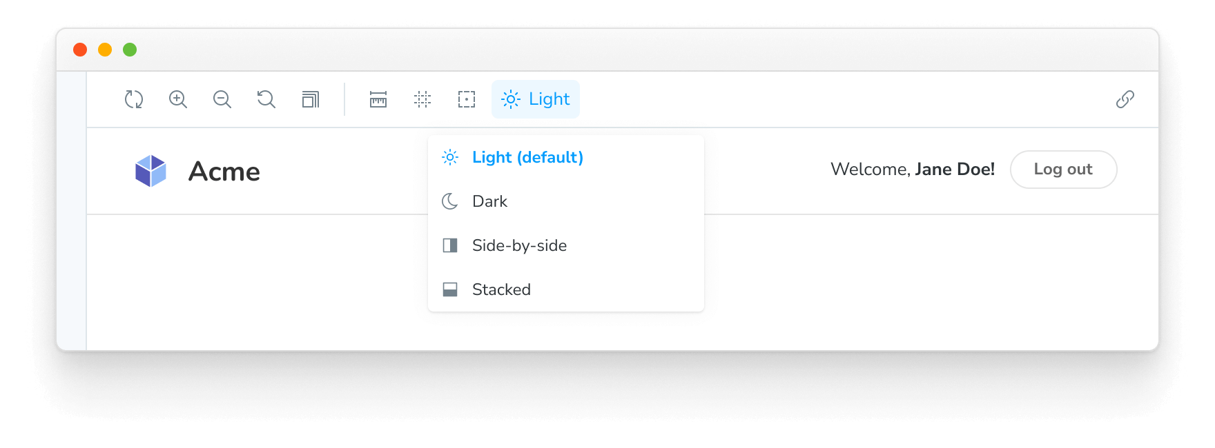
當您啟動 Storybook 時,您的工具列應該會有一個新的下拉式選單,其中包含 light 和 dark 選項。
建立裝飾器
我們已經實作了一個 global。讓我們連線它!我們可以使用 context.globals.theme 值在裝飾器中取用新的 theme 全域變數。
例如,假設您正在使用 styled-components。您可以將主題提供者裝飾器新增至您的 .storybook/preview.js|ts 設定
// Replace your-framework with the framework you are using (e.g., solid, qwik)
import { Preview } from '@storybook/your-framework';

import { MyThemes } from '../my-theme-folder/my-theme-file';

const preview: Preview = {
  decorators: [
    (story, context) => {
      const selectedTheme = context.globals.theme || 'light';
      const theme = MyThemes[selectedTheme];
      return (
        // Your theme provider and other context providers go here
      )
    },
  ],
};

export default preview;
在 Story 上設定全域變數
當在 Storybook 中使用工具列選單變更全域值時,在您於 Story 之間瀏覽時,該值會持續使用。但有時 Story 需要特定值才能正確渲染,例如,針對特定環境進行測試時。
為了確保 Story 一律使用特定的全域值,無論工具列中選擇了什麼,您都可以在 Story 或元件上設定 globals 註釋。這會覆寫這些 Story 的全域值,並且在檢視 Story 時停用該全域變數的工具列選單。
// Replace your-framework with the name of your framework
import type { Meta, StoryObj } from '@storybook/your-framework';

import { Button } from './Button';

const meta: Meta<typeof Button> = {
  component: Button,
  globals: {
    // 👇 Set background value for all component stories
    backgrounds: { value: 'gray', grid: false },
  },
};

export default meta;
type Story = StoryObj<typeof Button>;

export const OnDark: Story = {
  globals: {
    // 👇 Override background value for this story
    backgrounds: { value: 'dark' },
  },
};
在上面的範例中,Storybook 會強制所有 Button 的 stories 使用灰色背景顏色,除了 OnDark 這個 story,它會使用深色背景。對於所有 Button 的 stories,工具列選單中的 backgrounds 全域設定會被停用,並顯示工具提示說明該全域設定是在 story 層級設定的。
設定 story 的 globals 註解來覆寫專案層級的全域設定很有用,但應該適度使用。在 story 層級沒有定義的全域設定可以在 Storybook 的 UI 中互動式地選擇,允許使用者探索每個現有的值組合 (例如,全域值、args)。在 story 層級設定它們會停用該控制項,阻止使用者探索可用的選項。
進階用法
到目前為止,我們已經在 Storybook 內部建立並使用了一個全域設定。
現在,讓我們看看一個更複雜的範例。假設我們想要實作一個新的全域設定,稱為 locale 用於國際化,它會在工具列的右側顯示一個旗幟。
在您的 .storybook/preview.js|ts 中,加入以下程式碼
// Replace your-framework with the framework you are using (e.g., react, vue3)
import { Preview } from '@storybook/your-framework';

const preview: Preview = {
  globalTypes: {
    locale: {
      description: 'Internationalization locale',
      toolbar: {
        icon: 'globe',
        items: [
          { value: 'en', right: '🇺🇸', title: 'English' },
          { value: 'fr', right: '🇫🇷', title: 'Français' },
          { value: 'es', right: '🇪🇸', title: 'Español' },
          { value: 'zh', right: '🇨🇳', title: '中文' },
          { value: 'kr', right: '🇰🇷', title: '한국어' },
        ],
      },
    },
  },
  initialGlobals: {
    locale: 'en',
  },
};

export default preview;範例中使用的 icon 元素會從 @storybook/components 套件載入圖示。請參閱這裡以取得您可以使用的可用圖示列表。
要使用工具列,您必須安裝 @storybook/addon-toolbars 附加元件,該元件預設包含在 @storybook/addon-essentials 中。
加入設定元素 right 會在您將其連接到裝飾器後,在工具列選單的右側顯示文字。
以下是可用的設定選項列表。
| MenuItem | 類型 | 描述 | 必要 |
|---|---|---|---|
| value | 字串 | 在全域設定中設定的選單的字串值 | 是 |
| title | 字串 | 標題的主要文字 | 是 |
| right | 字串 | 一個字串,顯示在選單的右側 | 否 |
| icon | 字串 | 如果選擇此項目,則會在工具列中顯示的圖示 | 否 |
從 story 中使用全域設定
我們建議從裝飾器中使用全域設定,並為所有 stories 定義一個全域設定。
但我們知道有時候在每個 story 的基礎上使用工具列選項會更有益。
使用上面的範例,您可以修改任何 story 以從 story 環境中檢索 Locale global
import type { Meta, StoryObj } from '@storybook/react';

import { MyComponent } from './MyComponent';

const meta: Meta<typeof MyComponent> = {
  component: MyComponent,
};

export default meta;
type Story = StoryObj<typeof MyComponent>;

const getCaptionForLocale = (locale) => {
  switch (locale) {
    case 'es':
      return 'Hola!';
    case 'fr':
      return 'Bonjour!';
    case 'kr':
      return '안녕하세요!';
    case 'zh':
      return '你好!';
    default:
      return 'Hello!';
  }
};

export const StoryWithLocale = {
  render: (args, { globals: { locale } }) => {
    const caption = getCaptionForLocale(locale);
    return <p>{caption}</p>;
  },
};
從附加元件中使用全域設定
如果您正在開發 Storybook 附加元件,並且需要檢索全域設定,您可以這麼做。@storybook/manager-api 套件為此情況提供了一個 hook。您可以使用 useGlobals() hook 來檢索任何您想要的全域設定。
使用上面的 ThemeProvider 範例,您可以將其擴展為在面板內顯示哪個主題處於活動狀態,如下所示
import React from 'react';

import { useGlobals } from '@storybook/manager-api';

import { AddonPanel, Placeholder, Separator, Source, Spaced, Title } from '@storybook/components';

import { MyThemes } from '../my-theme-folder/my-theme-file';

// Function to obtain the intended theme
const getTheme = (themeName) => {
  return MyThemes[themeName];
};

const ThemePanel = (props) => {
  const [{ theme: themeName }] = useGlobals();

  const selectedTheme = getTheme(themeName);

  return (
    <AddonPanel {...props}>
      {selectedTheme ? (
        <Spaced row={3} outer={1}>
          <Title>{selectedTheme.name}</Title>
          <p>The full theme object</p>
          <Source
            code={JSON.stringify(selectedTheme, null, 2)}
            language="js"
            copyable
            padded
            showLineNumbers
          />
        </Spaced>
      ) : (
        <Placeholder>No theme selected</Placeholder>
      )}
    </AddonPanel>
  );
};
從附加元件更新全域設定
如果您正在開發一個需要更新全域設定並刷新 UI 的 Storybook 附加元件,您可以這麼做。如先前所述,@storybook/manager-api 套件為此情況提供了必要的 hook。您可以使用 updateGlobals 函式來更新您需要的任何全域值。
例如,如果您正在開發一個 工具列附加元件,並且您希望在使用者點擊按鈕後刷新 UI 並更新全域設定
import React, { useCallback } from 'react';

import { FORCE_RE_RENDER } from '@storybook/core-events';
import { useGlobals } from '@storybook/manager-api';

import { IconButton } from '@storybook/components';
import { OutlineIcon } from '@storybook/icons';

import { addons } from '@storybook/preview-api';

const ExampleToolbar = () => {
  const [globals, updateGlobals] = useGlobals();

  const isActive = globals['my-param-key'] || false;

  // Function that will update the global value and trigger a UI refresh.
  const refreshAndUpdateGlobal = () => {
    // Updates Storybook global value
    updateGlobals({
      ['my-param-key']: !isActive,
    }),
      // Invokes Storybook's addon API method (with the FORCE_RE_RENDER) event to trigger a UI refresh
      addons.getChannel().emit(FORCE_RE_RENDER);
  };

  const toggleOutline = useCallback(() => refreshAndUpdateGlobal(), [isActive]);

  return (
    <IconButton
      key="Example"
      active={isActive}
      title="Show a Storybook toolbar"
      onClick={toggleOutline}
    >
      <OutlineIcon />
    </IconButton>
  );
};